I wanted to let everyone know of this lovely blog I stumbled upon a couple weeks ago or so: Susie's scrapactivities and freebies. Susie is generous, thoughtful and kind. The blog is a treasure trove of free digital goodness! All she asks in return is some love in the form of comments. Please go over and comment on this post. Every comment means she will provide another freebie (and who doesn't appreciate nice comments?). Also, anyone interested in ATC's should be thrilled with all the ATC items she has created.
Thanks for calling at the Hall!
August 12, 2010
August 3, 2010
The Importance of a Card
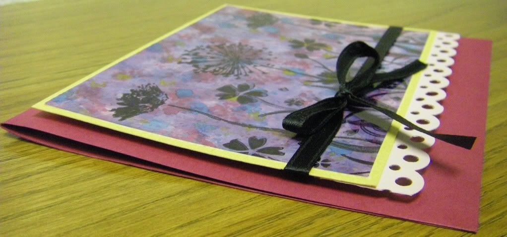
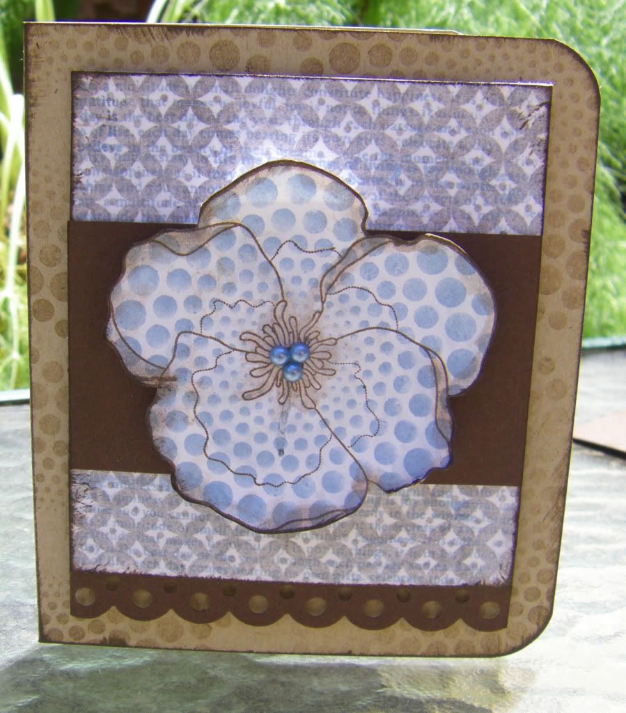
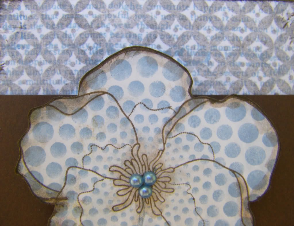
Sometimes I think I forget the power of a handmade card. When I lost my grandpa a month ago, the last communication I had with him was the father's day card I sent. Honestly, I had to push myself to make cards this year, but even as I was writing a message to him I was aware this might just be the last card I would make for him. I am really not sure what impact it had on him, but I know it gave me a small measure of comfort to know he received a card I made to honor him and express my love for him. I am so glad I realized I needed to make this card.
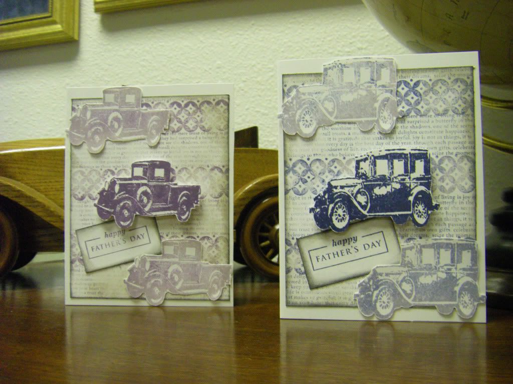
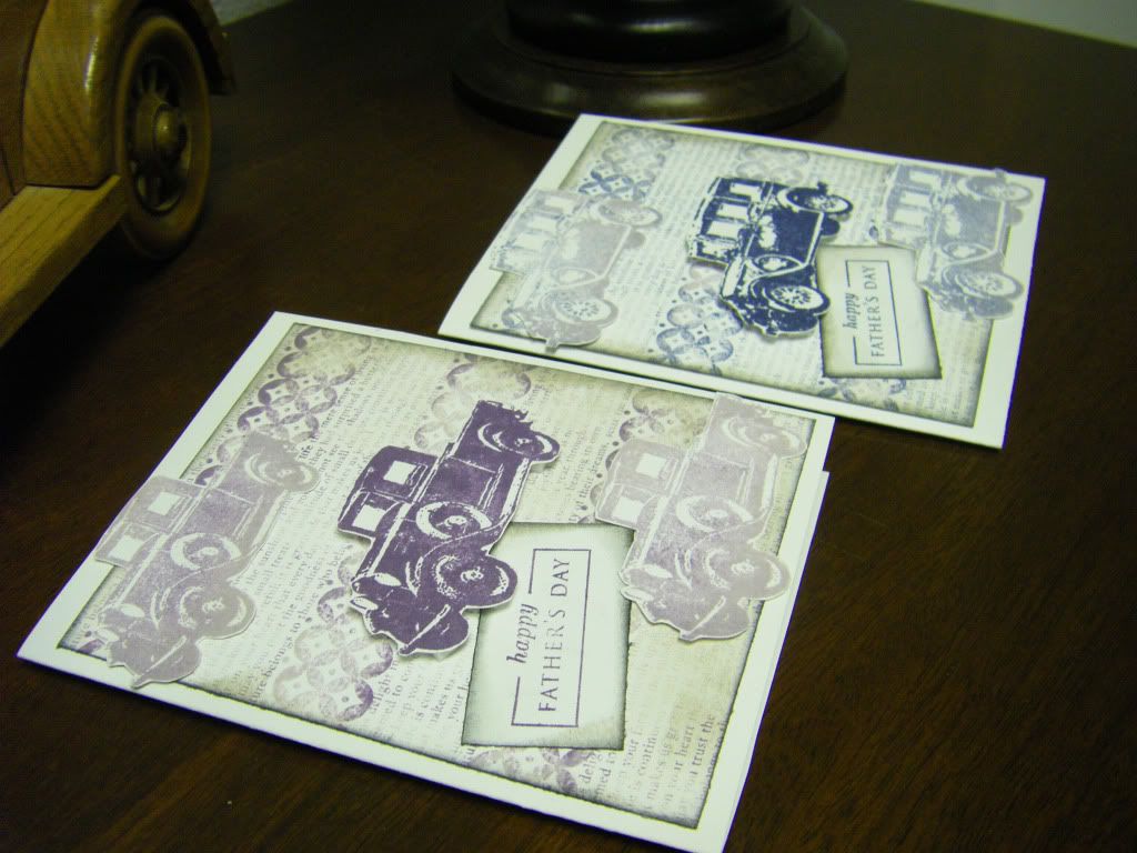
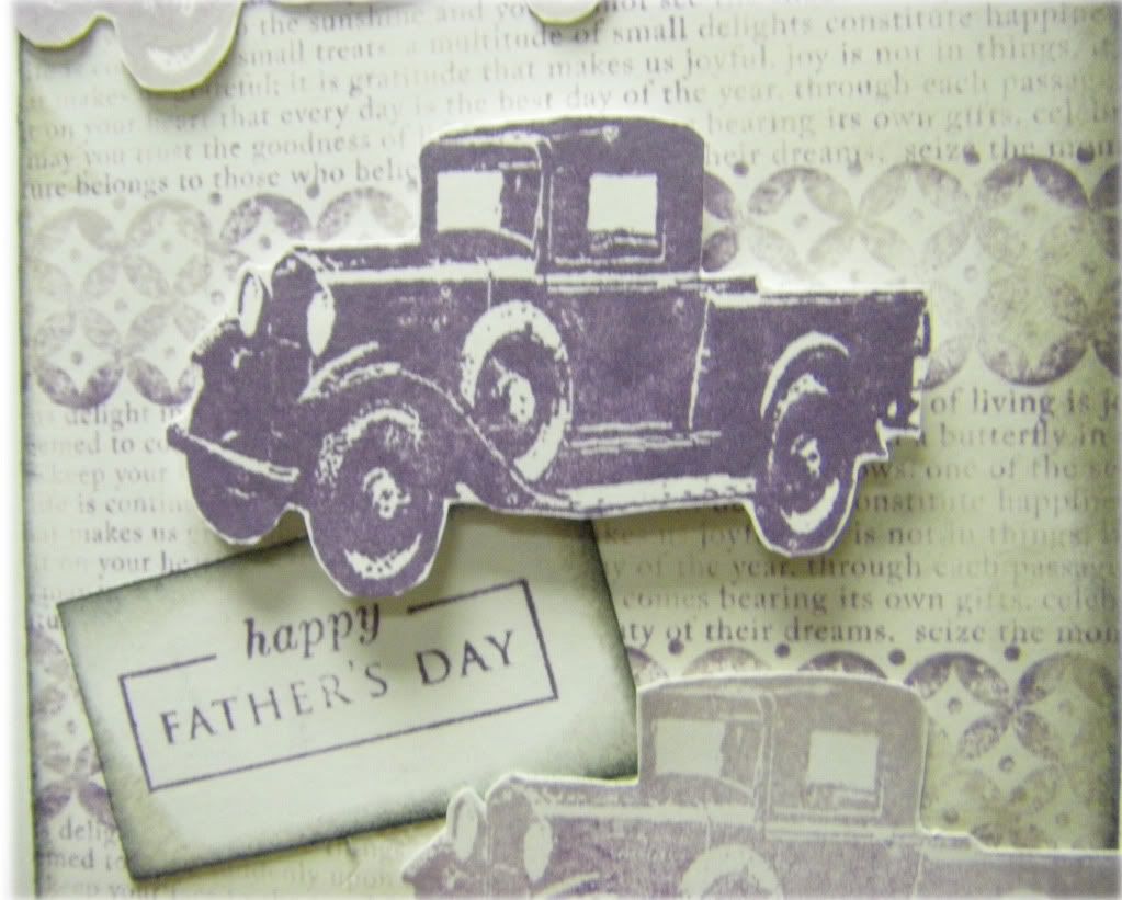
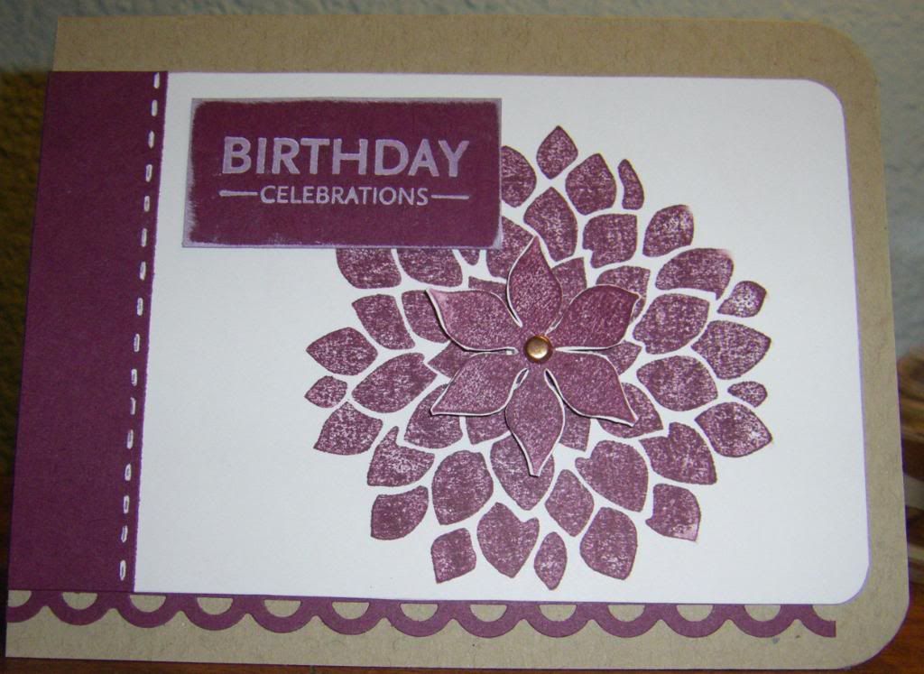
These are the cards I made for my grandpas this year (the purple was for my dad's father who just passed away as purple was his favorite):
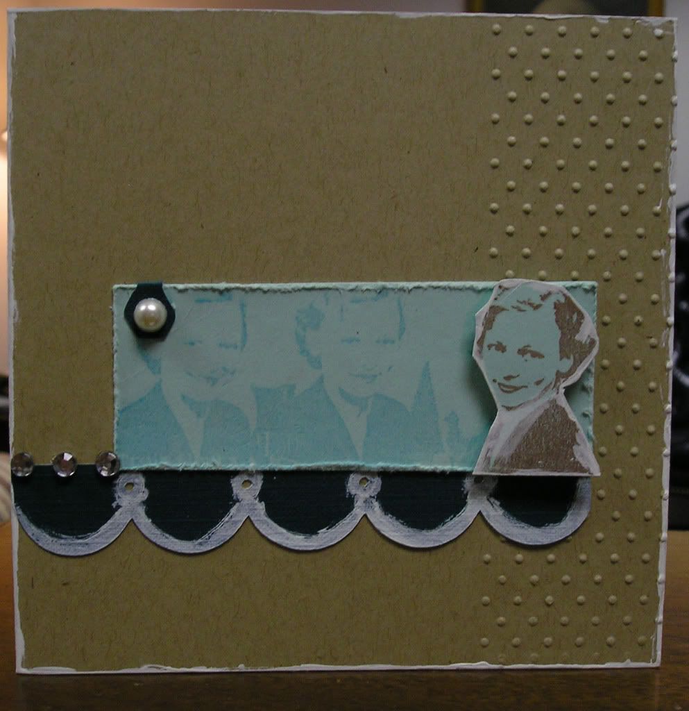
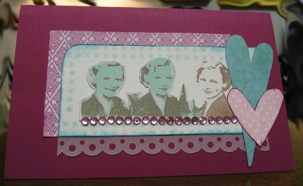
My grandma (my dad's mom and wife to my purple loving grandpa) this year mentioned how much she liked the card I made her for mother's day (you can see a picture of it here). It was also the last mother's day card I will ever make for her as she passed away Friday. I am so very glad she thought it was pretty.
Send a little love today--you and the lucky recipient will glad you did.
Thanks for dropping by the Hall!
Happy Father's Day
{Supplies}
Stamps: Truck and Car, Tim Holtz by Stampers' Anonymous; Happy Father's Day (from Father Knows Best set), Diamond Background (from Backgrounds Basics: Diamonds set), Text Background (from Background Basics: Text Style II set), Papertrey Ink
Inks: Milled Lavender, Dusty Concord, Chipped Sapphire, Stormy Sky and Pumice Stone (my favorite), Tim Holtz Distress Ink by Ranger Industries
Cardstock: White, Georgia Pacific; Earthstone, Neenah Papers
Other: Foam Dimensional Adhesive, American Crafts
These are the cards I made for my grandpas this year (the purple was for my dad's father who just passed away as purple was his favorite):
My grandma (my dad's mom and wife to my purple loving grandpa) this year mentioned how much she liked the card I made her for mother's day (you can see a picture of it here). It was also the last mother's day card I will ever make for her as she passed away Friday. I am so very glad she thought it was pretty.
Send a little love today--you and the lucky recipient will glad you did.
Thanks for dropping by the Hall!
Happy Father's Day
{Supplies}
Stamps: Truck and Car, Tim Holtz by Stampers' Anonymous; Happy Father's Day (from Father Knows Best set), Diamond Background (from Backgrounds Basics: Diamonds set), Text Background (from Background Basics: Text Style II set), Papertrey Ink
Inks: Milled Lavender, Dusty Concord, Chipped Sapphire, Stormy Sky and Pumice Stone (my favorite), Tim Holtz Distress Ink by Ranger Industries
Cardstock: White, Georgia Pacific; Earthstone, Neenah Papers
Other: Foam Dimensional Adhesive, American Crafts
August 2, 2010
Absolutely Fabulous Spray Paint
I am presently taking a class with the super talented Debee Campos. If you have ever happened upon her blog you will see some fantastic eye-candy. We are working on mini-albums, but since I had an ATC trade coming up with the theme of Altered Playing Cards I thought I would use the first day's art lesson to create my cards. I had an incredible amount of fun playing with spray paint and I think black and white shall soon be joined by chartreuse, aqua, yellow, orange, grey and purple (some of the colors for Halloween).
I really love how they turned out--both grungy and clean which is something I have never really accomplished before.
Here are my ATC's (and please forgive the quality of the photos):


Absolutely Fabulous ATC's
{Supplies}
Stamps: Absolutely Fabulous, Papertrey Ink; Label, Kenner Road
Mist/Spray: Sweet Pea, Glimmer Mist
Die Cut: Bird, Tim Holtz by Sizzix
Punch: Starburst, Martha Stewart Crafts
Watercolors: Crayola
Other: Matte Black & Glossy White Spray Paint; Dimensional Foam Adhesives, American Crafts
I really love how they turned out--both grungy and clean which is something I have never really accomplished before.
Here are my ATC's (and please forgive the quality of the photos):
Absolutely Fabulous ATC's
{Supplies}
Stamps: Absolutely Fabulous, Papertrey Ink; Label, Kenner Road
Mist/Spray: Sweet Pea, Glimmer Mist
Die Cut: Bird, Tim Holtz by Sizzix
Punch: Starburst, Martha Stewart Crafts
Watercolors: Crayola
Other: Matte Black & Glossy White Spray Paint; Dimensional Foam Adhesives, American Crafts
July 28, 2010
Bad Blogger: A Very Necessary Apology
I have been a very bad blogger in more ways than one.
I just recently enrolled in Shimelle Laine's Blogging for Scrapbookers class and I found out I was doing a big no-no...this no-no is actually somewhat counter to my thoughts on what is proper etiquette in the real world, but makes complete sense in the digital world. What I did a few times was use an image by using a link to the original image along with including a source link. I thought I was making certain that I was not taking any sort of credit for the image, but this meant I was stealing bandwidth. Big no-no. I apologize for my extremely inconsiderate behavior and will be taking out all such images.
Additionally, I apologize for also including images from others without their permission. I realize now I have allowed my (mistaken) belief in the internet being somewhat of a Wild West to cloud my ethics. I need to receive permission from the creator/artist before posting any image here or only post images of my own. Otherwise, I am being extremely rude and far worse poaching (stealing) others' hard work, creativity, talent, skill and energy.
This reminds me of receiving the guidelines to proper crediting of sources in college. Having read it I became profounding afraid of improperly crediting a source or somehow accidentially tredding on another's creative and/or intellectual property. Because of this (among other reasons), papers became an exercise in anxiety-ridden torture for me to write. I should have thought of that handbook whilst I blogged!
My apologies to one and all for being a very bad blogger and member of the creative community.
Another lesson learned.
June 29, 2010
Shop Talk: A Strenuous Recommendation
I can't believe June is nearly over and I haven't posted since early May. I have some half written posts that are at various stages, but they aren't complete obviously. I feel I must rectify this by at least posting once.
Where have I been you may (or probably not) ask. I have been sucked into technology actually. I recently have been keeping up with all those digital scrapbook sites, looking into online classes and listening to the ever amusing and interesting Paperclipping podcasts. Anyone listen to these? What do you think? I find them to be wonderful and I am listening to them all the time right now...as I brush my teeth (seriously), go to sleep, etc. I love shop talk. I have a couple of friends that I talk with about art and all things related and we can talk until the end of days and still have more to chat about. We discuss stamps, paper, paint, companies, artists, digital design, classes, new products, old products, how evil Martha Stewart is (she is I swear to always find ways to make me covet her products), Tim Holtz, scrapbooking, websites, blogs, time, organization, projects here and there, kit companies, and on and on. So listening to the Paperclipping Roundtable and Paperclipping Digi Show is like ambrosia (as in food of the art and crafting gods) to me.
The all important links:
Paperclipping Roundtable (available on iTunes FREE)
Paperclipping Digi Show (available on iTunes FREE)
They also offer a membership for their copious amount of video tutorials (very well done from the clips I have seen). I plan on joining at some point because Noell and Izzy Hyman (the couple behind Paperclipping) deserve the support.
If you haven't already discovered these shows, GO. It is catnip for scrapbookers, memory artists or anyone interested in listening to various subjects regarding creating, organization, process, design, the industry, photography, digital scrapbooking, etc.
May 7, 2010
Mother's Day
Mother's Day is just around the corner and I luckily still have both of my grandmothers to make cards for. During the Hero Arts Club meeting in March we played around with alcohol inks (fun!). I happened to make a card in which I covered both front and back with alcohol ink and stamped on with flowers. Because the colors ended up being purplish and the stamps were flowers I knew I could cut up the card into two panels for my grandmothers (one of them loves purple and the other loves flowers). I would usually make two different takes on the cards, but after it took me an hour to find this card (I have reorganized which basically means I have to figure out the new places I put things) I decided it would make more sense to make the same card (there are very slight variations like size). I chose a very simple layout and application (I am shocked at myself!) and let the alcohol ink panel really be the star.
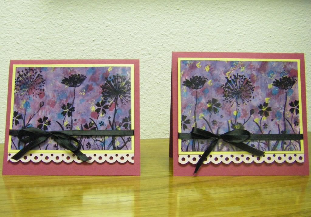
I wish all the mothers, grandmothers and caregivers out there a very wonderful Mother's Day. May your day be filled with love and care.
Thanks for calling at the Hall!
Flower Power Mother's Day Cards
Supplies
Stamps: Silhouette Burst (H5312), Flower Blossoms (F4489) and Flower (not sure what stamp this is even after an extensive web search), Hero Arts
Inks: Jet Black, Archival Ink by Ranger Industries
Alcohol Inks: Cranberry, Pool, Stream and Gold (if I remember correctly), Tim Holtz Adirondack by Ranger Industries
Cardstock: Purely Pomegranate, Stampin' Up!; Lavender Moon, Papertrey Ink; Gold Metallic
Border Punch: Dot Scallop, Martha Stewart Crafts
Other: Black Ribbon, Ofray; This-to-That Dimensional Foam Adhesive, American Crafts (my new favorite for chunky dimension!)
May 6, 2010
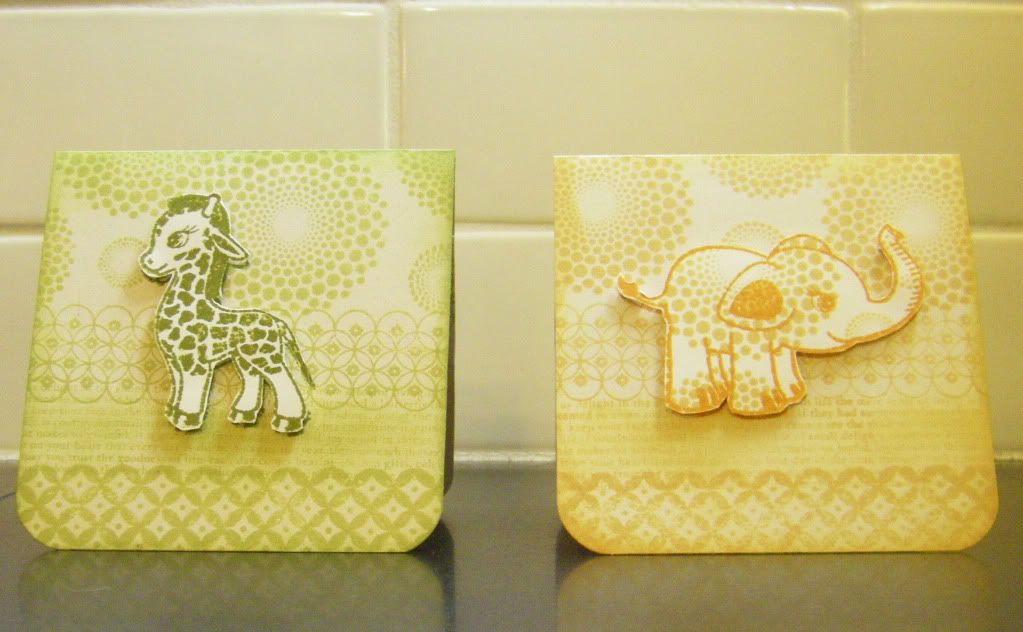
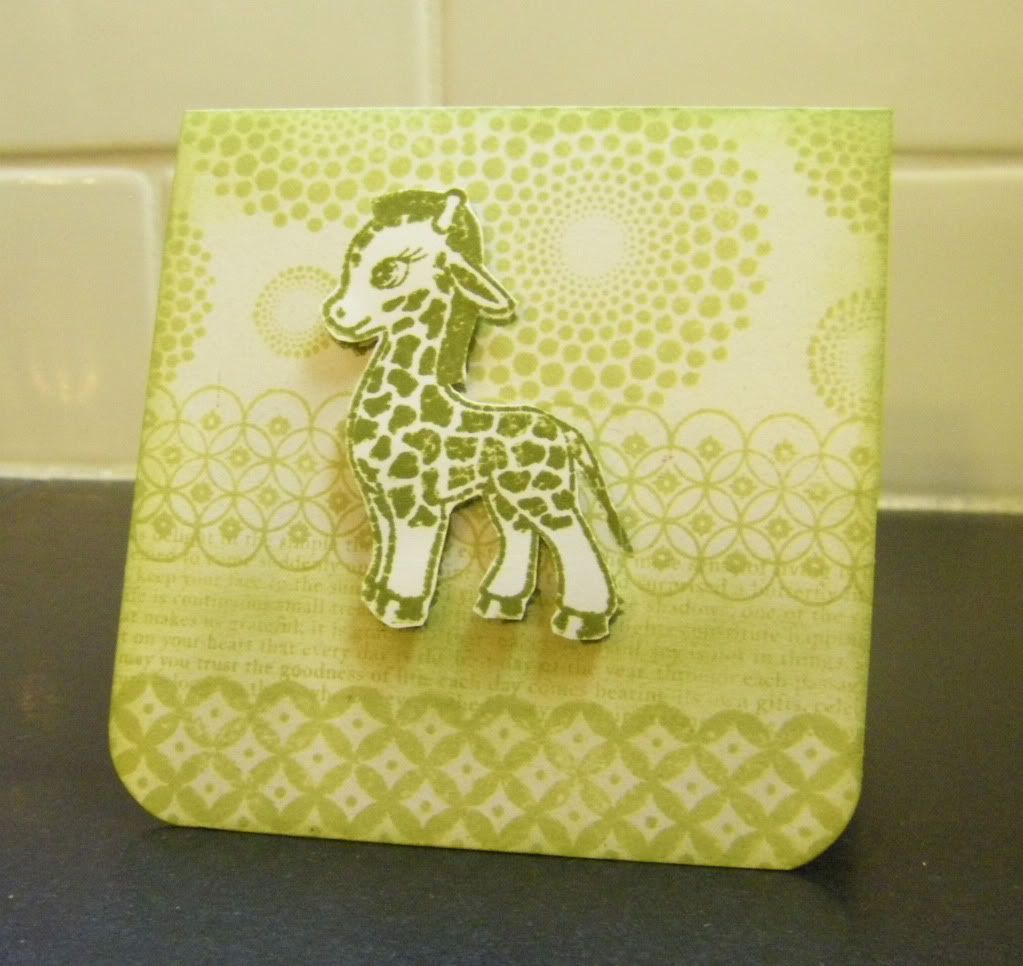
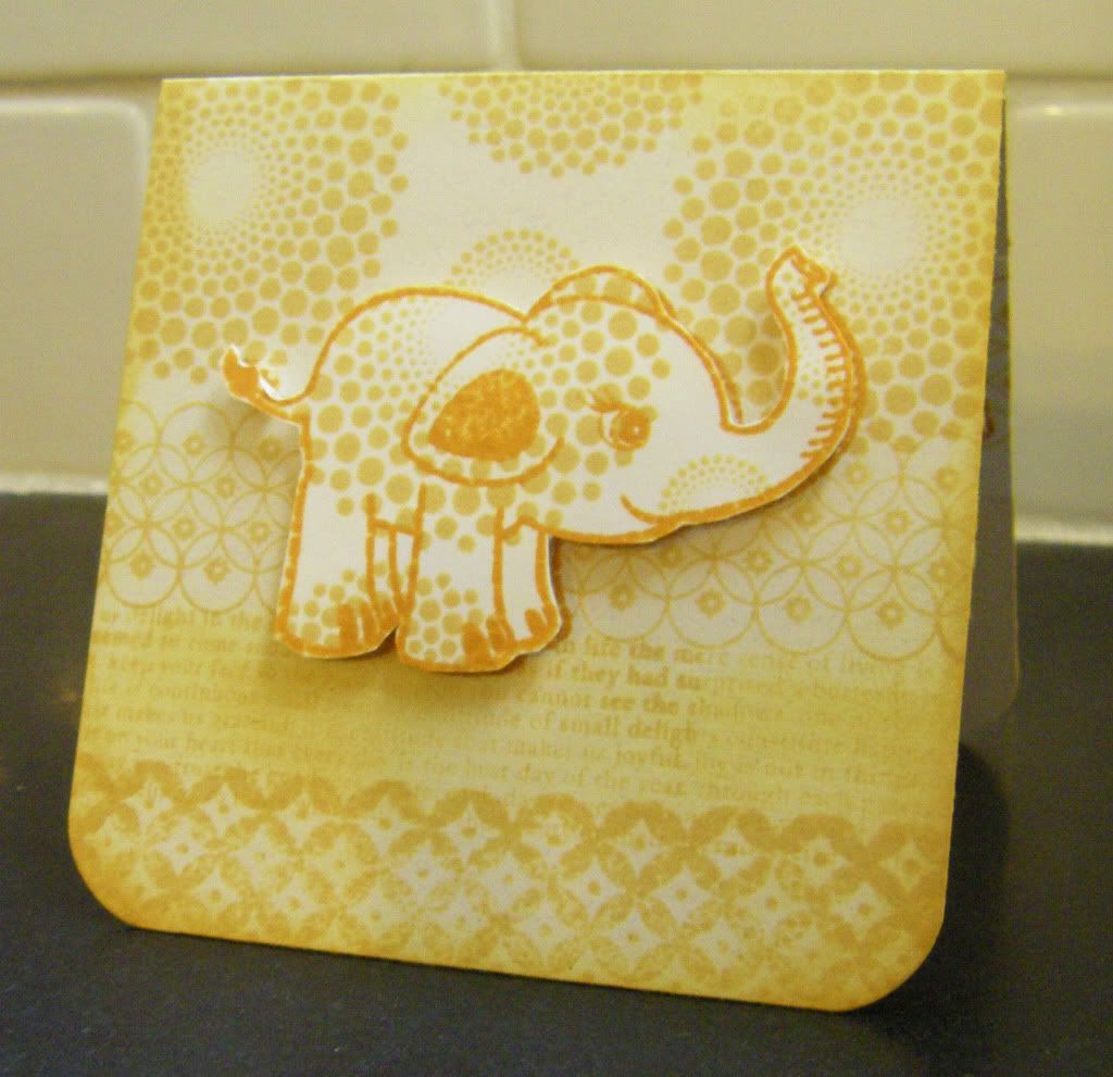
Seeing Double
Hello everyone! Welcome to any new readers! How is everyone doing this fine week? Can you believe it is May already (I say this every month though)?!? Time seems to be in fast forward. Anyone else experiencing that sensation? I imagine parents must experience it accutely with how quickly children grow up. One minute you are anxiously awaiting their arrival and the next you are anxiously awaiting their first words, first steps, first day of school and so on.
I recently needed to make a card to go with a gift for a friend expecting twins--identical boys actually--and what could be more adorable than identical multiples? Well, unless there are too many, they act as a singular unit, have strange menacing powers and look too eerily alike as in "Village of the Damned" and then it becomes scary. Back to reality, I decided since there are two boys there should be two similar cards, but not identical (the kids may be identical, but they will not be of one mind unlike...see comment regarding "Village of the Damned" above).
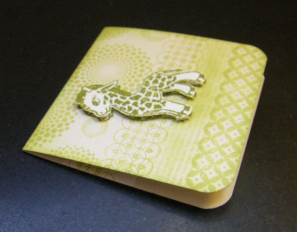
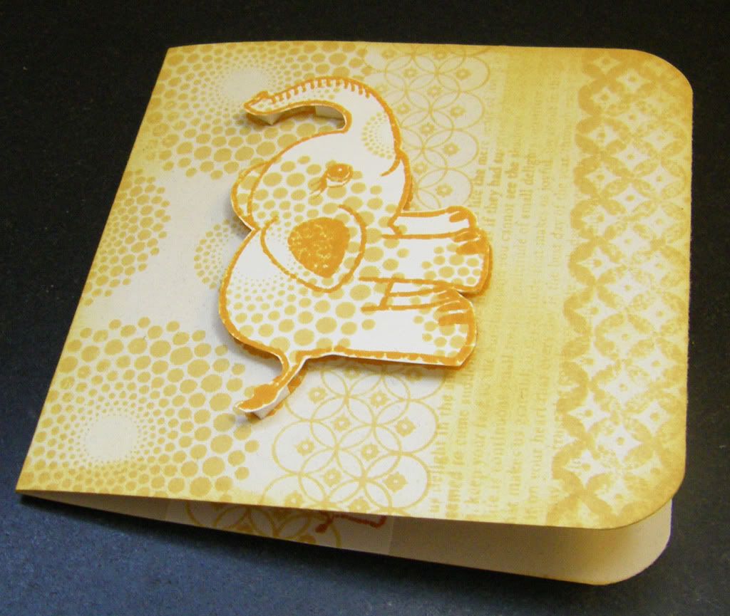
I decided to go monochromatic and play more with pattern. I chose the baby animals from the Little One Just Born set from L'il Davis Designs that I've had for a while because they are just so adorable. I did stamp Dot Spot on the elephant to add interest and tie it in with the pattern already on the giraffe. I am pretty happy with the results. And I am loving Papertrey Ink's background stamps.
I hope you enjoy the cards too:
Inside the cards:
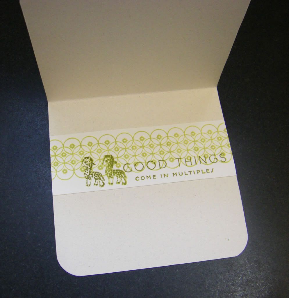
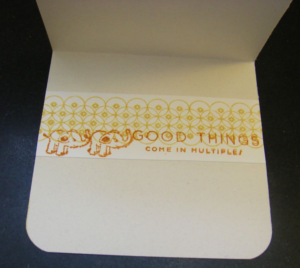
Thank you for calling at the Hall!
Verdant Baby Giraffe Card
Supplies
Stamps: Baby Giraffe (from Little One Just Born set), Li'l Davis Designs; Dot Spot, Background Basics: Diamonds, Background Basics: Text Style and Bitty Baby Blessings (inside card); Papertrey Ink
Inks: Shabby Shutters & Peeled Paint, Tim Holtz Distress Inks by Ranger Industries
Cardstock: White, Georgia Pacific; Earthstone, Neenah PapersOther: Crop-A-Dile Corner Chomper, We R Memory Keepers
Golden Baby Elephant Card
Supplies
Stamps: Baby Elephant (from Little One Just Born set), Li'l Davis Designs; Dot Spot, Background Basics: Diamonds, Background Basics: Text Style and Bitty Baby Blessings (inside card); Papertrey Ink
Inks: Scattered Straw, Wild Honey and Rusty Hinge (inside card), Tim Holtz Distress Inks by Ranger Industries
Inks: Scattered Straw, Wild Honey and Rusty Hinge (inside card), Tim Holtz Distress Inks by Ranger Industries
Cardstock: White, Georgia Pacific; Earthstone, Neenah Paper
Other: Crop-A-Dile Corner Chomper, We R Memory Keepers
April 27, 2010
Purple Haze
Firstly, I wanted to thank everyone who has commented recently due to the Papertrey Ink blog hop. I have enjoyed reading everyone's comments and visiting your blogs and marvelling at the talent and cleverness!
Last Thursday night (April 22nd) found me needing to make a card for a college friend of mine. I have been really remiss in sending out cards for ages now, but I have been trying hard to get out cards for birthdays this year. So far I believe I am pretty much on target (with a few belated cards like this one). My college friends have been sadly neglected and they really shouldn't be as they are special ladies.
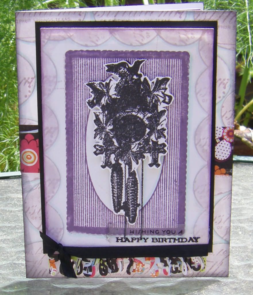
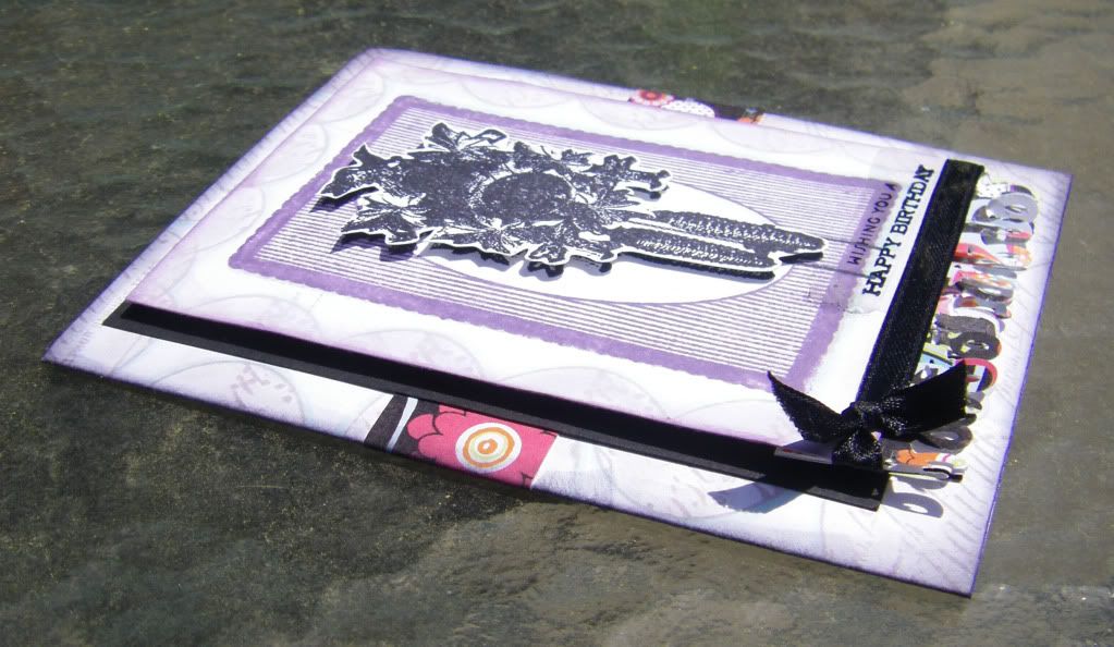
I had two directions when I began constructing this card: using my Kenner Road stamps again and incorporating purple. Upon showing this card separately to my mom and sister they both asked if purple was my friend's favorite color and that is not the reason why I chose purple. I think my college days have a purple haze around them...purple reminds me of my college friends and it just felt right. I searched through my Scarlet Lime kits (and some of my other kits) and came to the conclusion that purple isn't all that popular (having said that just yesterday I received my April kit from Kenner Road and it has a wonderful purple punch). Still I found that the paper (Deep Black Patch from the Nancy Jane Collection by ADORNit - Carolee's Creations) I used from the April 2009 Scarlet Lime kit to make the Gypsy Bird Card has a touch of purple...I really am digging this paper (perhaps because it has black, white, aqua and limey green...colors that I go to over and over again). Maybe it is a year old, but I have never been one to live completely in the moment as I always have a foot in the past (and a thought or two in the future). And like the Gypsy Bird Card I again did the pleat using the strip of the paper I had punched because I dig that too.
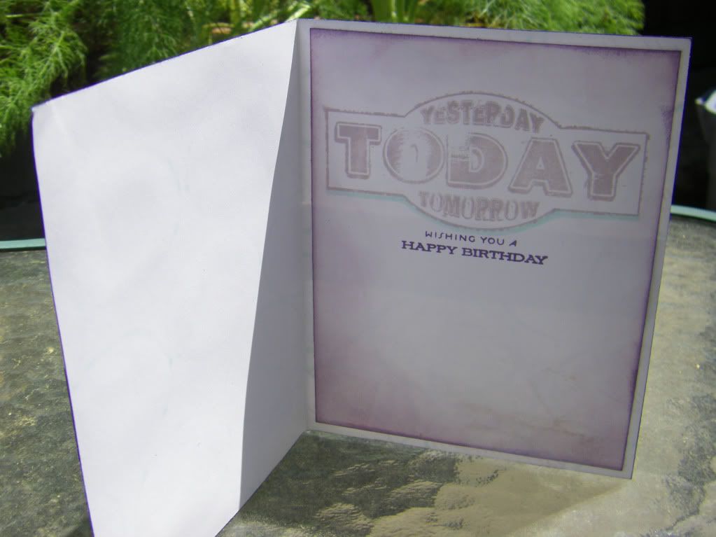
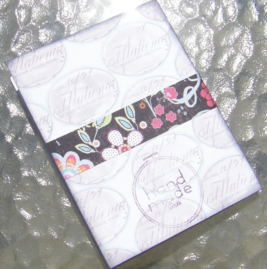
Here is the purple card I made with pictures of the front, inside and back (as always please forgive my shameful photography):
And for those interested in seeing a picture of the paper:
Last Thursday night (April 22nd) found me needing to make a card for a college friend of mine. I have been really remiss in sending out cards for ages now, but I have been trying hard to get out cards for birthdays this year. So far I believe I am pretty much on target (with a few belated cards like this one). My college friends have been sadly neglected and they really shouldn't be as they are special ladies.
I had two directions when I began constructing this card: using my Kenner Road stamps again and incorporating purple. Upon showing this card separately to my mom and sister they both asked if purple was my friend's favorite color and that is not the reason why I chose purple. I think my college days have a purple haze around them...purple reminds me of my college friends and it just felt right. I searched through my Scarlet Lime kits (and some of my other kits) and came to the conclusion that purple isn't all that popular (having said that just yesterday I received my April kit from Kenner Road and it has a wonderful purple punch). Still I found that the paper (Deep Black Patch from the Nancy Jane Collection by ADORNit - Carolee's Creations) I used from the April 2009 Scarlet Lime kit to make the Gypsy Bird Card has a touch of purple...I really am digging this paper (perhaps because it has black, white, aqua and limey green...colors that I go to over and over again). Maybe it is a year old, but I have never been one to live completely in the moment as I always have a foot in the past (and a thought or two in the future). And like the Gypsy Bird Card I again did the pleat using the strip of the paper I had punched because I dig that too.
Here is the purple card I made with pictures of the front, inside and back (as always please forgive my shameful photography):
And for those interested in seeing a picture of the paper:
I hope you have a joyous day and thanks for calling at the Hall!
Black & Purple Timely Birthday Card
Supplies:
Stamps: Cuckoo Clock, Home Sweet Home Frame, Vintage Seal, Yesterday Today Tomorrow and Embroidery Hoop, Kenner Road; Wishing You a Happy Birthday (from Everyday Classics set), Papertrey Ink
Inks: Black Soot, Dusty Concord and Milled Lavender, Tim Holtz Distress Inks by Ranger Industries; Jet Black, Archival Ink, Ranger Industries
Cardstock: White, Georgia Pacific; Black, Stampin' Up!
Patterned Paper: Deep Black Patch (from Nancy Jane Collection), Adornit Carolee's Creations
Punches: Loop Border Punch, Martha Stewart Crafts; Modern Label, Stampin' Up!
Other: Transparency; Copic Marker; Black Ribbon, Offray; Foam Dimensional Adhesive
April 26, 2010
Hero Arts Club: Engraved Daisies
I was going to go to sleep early Thursday night before last (April 15th)...honestly I was, but then I began casually flipping through some issues of Somerset Studio I hadn't read yet and it struck me that I needed to make something. The following evening (Friday, April 16th) I had a Hero Arts Club meeting (a monthly occurance) and Jane, our organizer, leader and teacher (she does it all and is terrific!) sends us off after each meeting with stamped images to create with to bring back for show and tell the following month. {A little plug now. If you are in the San Antonio area, are interested in anyway in Hero Arts or stamping this monthly club is wonderful. You'll want to contact Stamp Antonio for more information.} I did make something our first month, but March no such luck which made me think I should do something for April's meeting. As I always need cards I decided to make one (I was contemplating other projects like an Artist Trading Card).
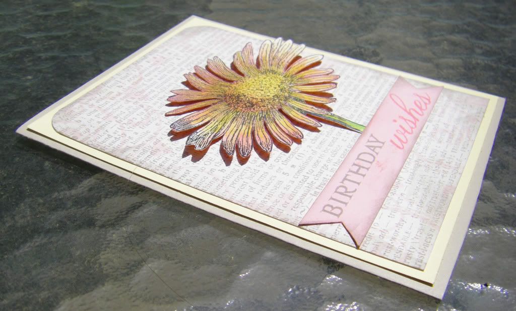
I began with coloring in the Engraved Daisy image Jane stamped for us with some colored pencils. I cut it out and then decided I wanted to try using the reverse side as a mask and applied ink using my ink blending tool. In that way I had the beginnings of two different cards. The reverse image I made into a bright, more graphic card and the card I created for the flower image I made softer with a bit of a vintage vibe.
Without further ado the cards:
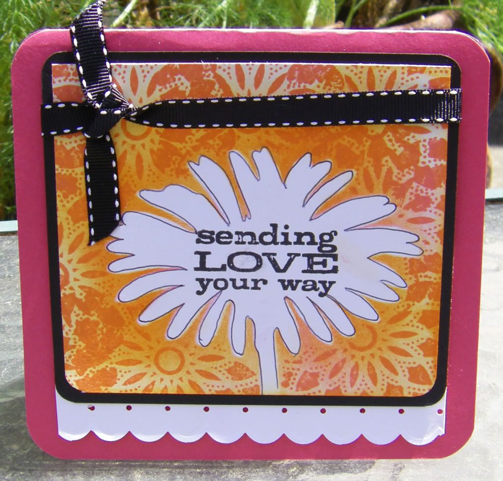
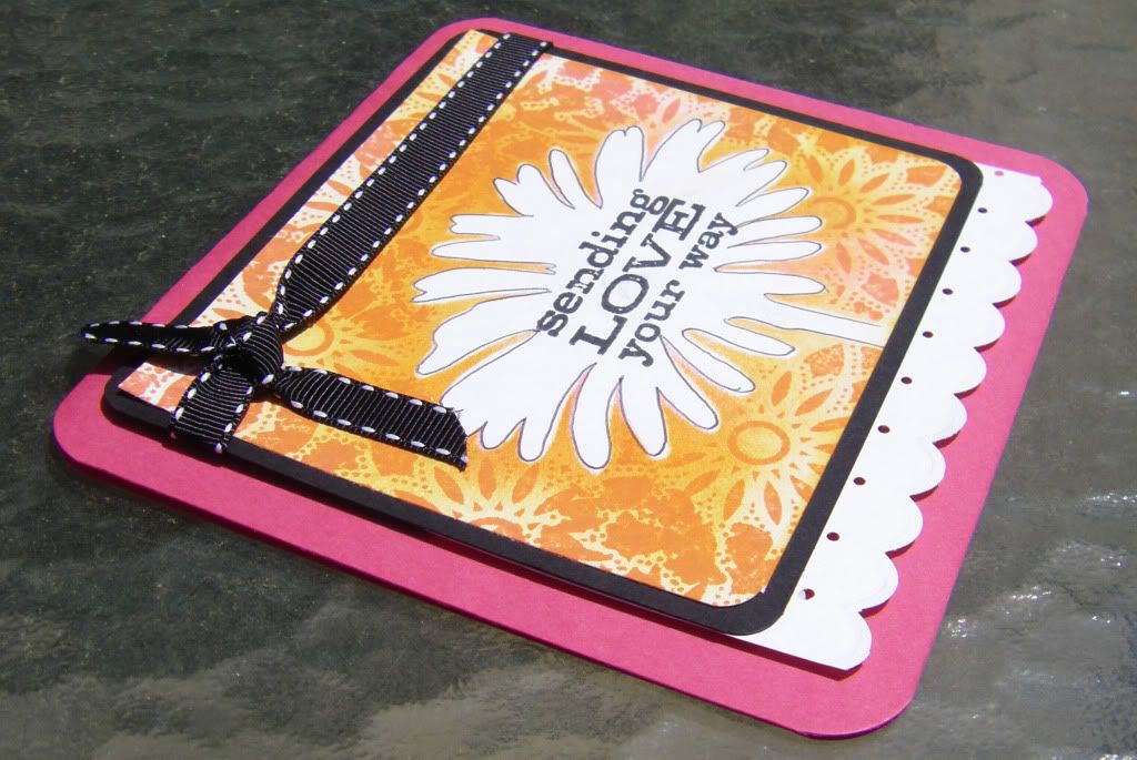

Thanks for calling at the Hall!
Sending Love Your Way Card
Supplies:
Stamps: Engraved Daisy (as mask), Starburst and Sending Love Your Way (from Tree, Birds and Messages set), Hero Arts
Inks: Black Soot, Spicy Marmalade and Worn Lipstick, Tim Holtz Distress Inks by Ranger Industries
Cardstock: Melon Mambo and Black, Stampin' Up!; White, Georgia-Pacific
Other: Crop-A-Dile Corner Chomper, We R Memory Keepers; Stiched Ribbon; Foam Dimensional Adhesives
Birthday Wishes Card
Supplies:
Stamps: Engraved Daisy, Heart Flourish and Friends Definition, Hero Arts; Birthday Wishes (from Giga Guide Lines set), Papertrey Ink
Inks: Pumice Stone (wonderful new color!), Worn Lipstick, Spun Sugar, Tim Holtz Distress Ink by Ranger Industries
Cardstock: Lemon Tart: Papertrey Ink; Earthstone and Sand, Neenah Papers; Pink
Other: Colored Pencils; Crop-A-Dile Corner Chomper, We R Memory Keepers; Foam Dimensional Adhesives
April 25, 2010
April's Papertrey Ink Blog Hop
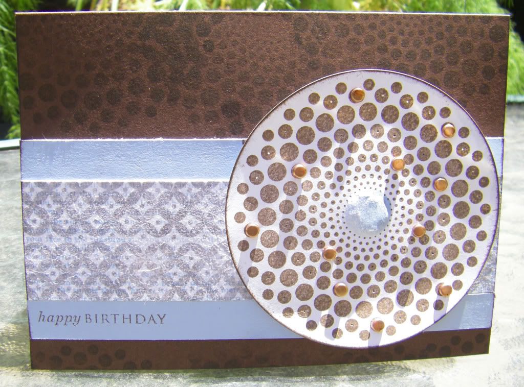
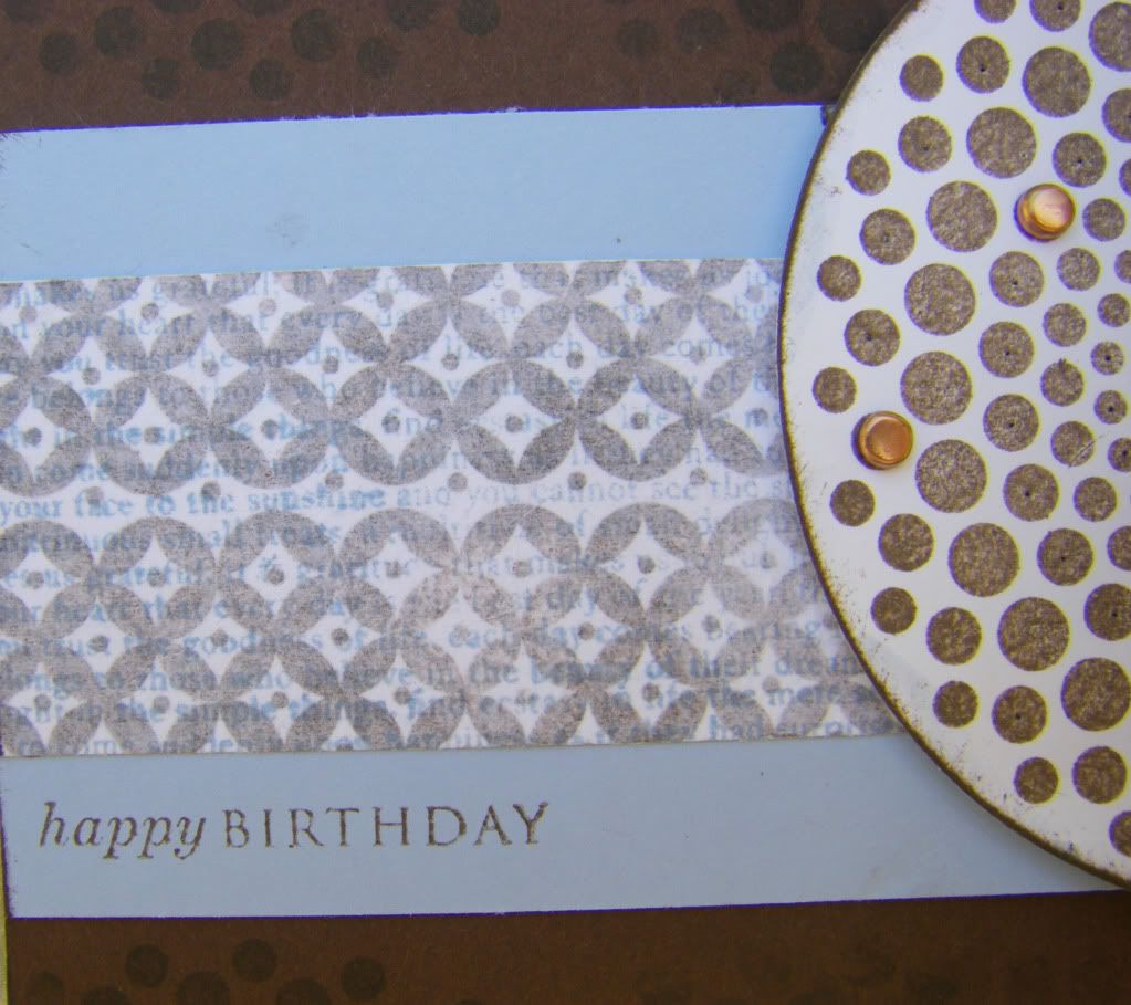
Hello and welcome fellow Papertrey Ink fans! I am so glad to be participating in this month's blog hop (my second). April's Blog Hop is all about using tissue paper. I decided to use it in a similar way as Nichole Heady did with the faux silk technique. I stamped a background using the Background Basics: Diamonds with Dark Chocolate ink and I stamped some white tissue paper using the Background Basics: Text Style with Spring Rain ink. I crumpled up the tissue paper and then adhered it to the Dark Chocolate stamped background. I thought it came out pretty cool. Using this piece I decided to make a couple of cards--one masculine (honestly I couldn't resist!) and the other feminine. I also decided to keep with the same colors and most of the same stamps (a good way to challenge myself to use stamp sets more creatively). I am happy with how I decided to use Dot Spot on the feminine card and mean to do so more in the future.
Enough writing though (I can almost hear the sighs of relief), here are the cards:
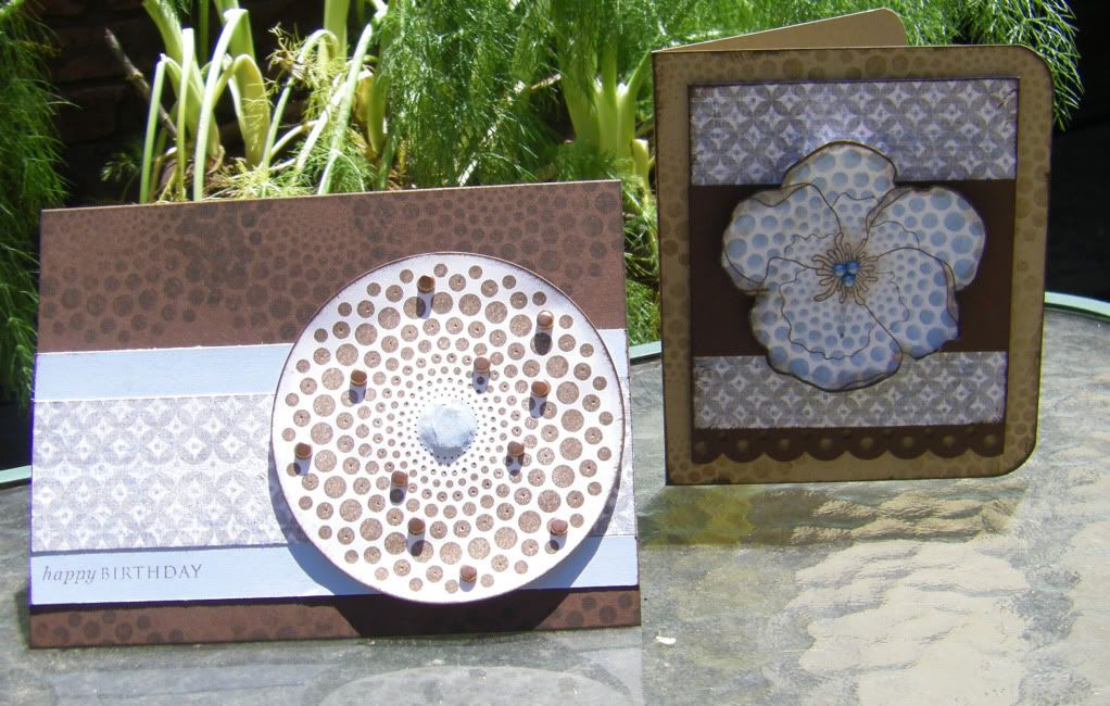
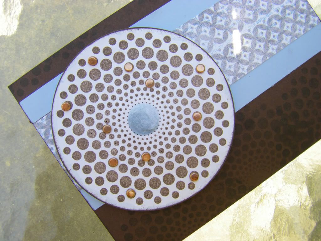
For the masculine card I did some subtle paper piercing and watercolored with the Spring Rain ink to create some interest in the center of the large Dot Spot image and also embossed the other side of the center so it popped out a bit. Lastly I added random brads for a little more dimension:
For the feminine card I stamped the violet over the large Dot Spot image and added a brown edge and center by using the Dark Chocolate ink with some water to paint it on.

I hope you enjoyed the cards! I can't wait to see all the wonderful projects you all made. Thanks for calling at the Hall.
Supplies:
Spotty Birthday Card
Stamps: Dot Spot, Basic Backgrounds: Text Style, Basic Backgrounds: Diamonds and Happy Birthday (from Father Knows Best set), Papertrey Ink
Inks: Dark Chocolate and Spring Rain, Papertrey Ink
Cardstock: Dark Chocolate and Spring Rain, Papertrey Ink; White, Georgia-Pacific
Other: White Tissue Paper, Papertrey Ink packaging; Copper Mini Brads; Foam Dimensional Adhesive
Dotty Violet Card
Stamps: Dot Spot, Basic Backgrounds: Text Style, Basic Backgrounds: Diamonds and Year of Flowers: Violets, Papertrey Ink
Inks: Dark Chocolate and Spring Rain, Papertrey Ink
Cardstock: Kraft and Dark Chocolate, Papertrey Ink; White, Georgia-PacificBorder Punch: Scallop Dot, Martha Stewart Crafts
Pearls: Denim, Kaisercraft
Other: White Tissue Paper, Papertrey Ink packaging; Crop-A-Dile Corner Chomper, We R Memory Keepers; Foam Dimensional Adhesive
April 23, 2010
Standouts
I recall mentioning using my Cricut and then setting a challenge for myself to use up all the shapes I had cut out to make cards last March (as in March 2009). I really should do such a challenge again because I enjoyed making the cards quite a bit and felt a thrill of accomplishment (I may have a low threshold).
Here is another such card this one I used a stamp I love from Stampington & Company designed by Carin Andersson. I believe at the time I was inspired by Heather Nichols to use kraft and white paint (I didn't have a good white ink at the time). Of course my cards don't have her rustic elegance, but they didn't turn out too shabbily.
What came from the Cricut were the scallops and the tab thing. I have no idea what the tab is really (maybe there is someone out there to enlighten me), but I used it as an embellishment.
Another card I made the same time with the same stamp with slightly different colors:
Notice I used the rest of the Aqua Mist ladies from the first card to add to this one. I was trying to be very thrifty and clever with my scraps.
The hardest part of blogging about older cards is trying to figure out what supplies I used. It is a bit of a crafting mystery I need to solve and I have to riffle around in the studio to find this stamp, this paint or that ink. Anyone else as mired in crafting puzzles?
Thank you for calling at the Hall!
The Standout Card
Supplies:
Stamp: Trio of Smiles, Stampington & Company
Inks: Amaretto Truffle Chalk Ink, Fresco by Stampa Rosa; Turquoise, Memories
Cardstock: Aqua Mist and Kraft, Papertrey Ink; Terrific Teal, DoubleMates by WorldWin Papers
Embossing Folder: Swiss Dots, Cuttlebug by Provo Craft
Craft Acrylic Paint: Warm White, Americana
Gems and Pearl: The Paper Company
Other: Cricut, Provo Craft; Tim Holtz Paper Distresser; Tonic Studios; Cuttlebug, Provo Craft; Dimensional Foam Adhesive
The Reverse Standout Card
Supplies:
Stamps: Trio of Smiles, Stampington & Company; Polka Dot heart (from little things set), urban lily;Motif on Long Heart (from Guide Lines set), Papertrey Ink; Border, Impress
Inks: Amaretto Truffle Chalk Ink, Fresco by Stampa Rosa; Turquoise, Memories; Aqua Mist, Papertrey Ink; Purely Pomegranate, Stampin' Up!; Bubblegum Pink, Marvy Matchables
Cardstock: Aqua Mist, Papertrey Ink; Purely Pomegranate, Stampin' Up!; White, Georgia-Pacific
Patterned Paper: 5th Avenue (from Tinsel Town collection), Pink Paislee; Vellum
Border Punch: Scallop Dot, Martha Stewart Crafts
Gems: The Paper Company
Other: Cricut, Provo Craft; corner punch;Tim Holtz Paper Distresser, Tonic Studios
April 15, 2010
The 14th of the Month
I love the 14th of the month for three reasons:
After I chatted, did a little (too little for my liking, but there is such a concept as a budget--ugly, nasty word!) shopping and pined for a whole lot more, I made another card. It came out a bit dark and full of grunge because it is yet another masculine card. I am coming to believe I make more masculine cards than feminine which is odd when I come to think of it...no wonder I am trying to build up my Tim Holtz stamps and products and other stamps and products that work for guys/boys. Thankfully, Papertrey Ink just addressed males in this month's release although unfortunately I can't buy any of it yet (budget rears its ugly, nasty head again).
Anyway, there was a typewriter with a typewriter font alphabet block stamp set from Studio Calico I wished to use and I decided to keep with the whole Basic Grey Origins kick I have had all year (Heck, why break with the trend when I had made cards for this cousin's brothers and father with the Origins line already. Surely he would wonder if his card didn't match--well, if he noticed such a thing). I may have gone a little overboard with the distressing and the card is a bit busy, oh and the concept I had has to be explained for anyone to get it (Hint: notice which letters I highlighted on the "typwritten page" coming out of the typewriter as it actually spells out something even if the letters aren't in order for the word), but it's the thought that counts, right?
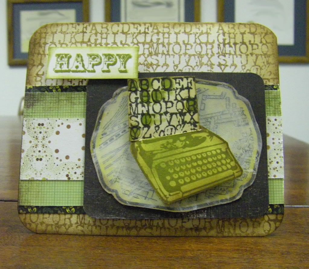
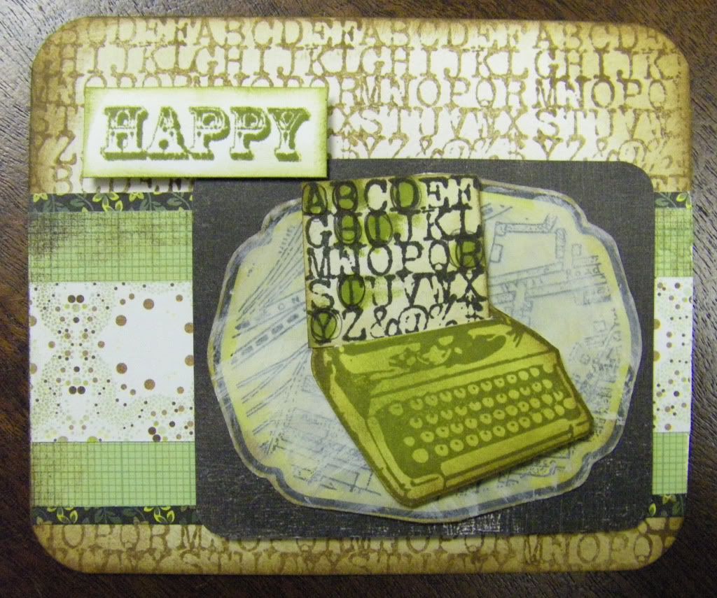
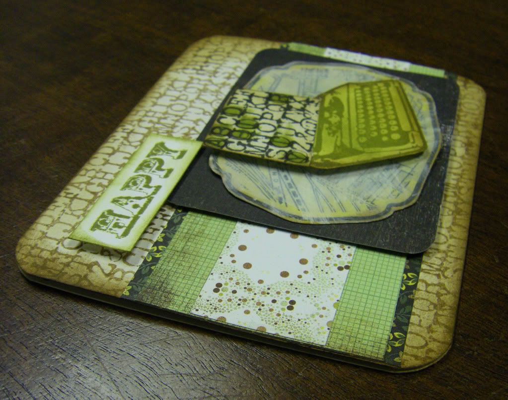
Typed Birthday Card
Supplies:
- Papertrey Ink Release
- Kenner Road Release
- Sneak Peek of the upcoming Studio Calico kit
After I chatted, did a little (too little for my liking, but there is such a concept as a budget--ugly, nasty word!) shopping and pined for a whole lot more, I made another card. It came out a bit dark and full of grunge because it is yet another masculine card. I am coming to believe I make more masculine cards than feminine which is odd when I come to think of it...no wonder I am trying to build up my Tim Holtz stamps and products and other stamps and products that work for guys/boys. Thankfully, Papertrey Ink just addressed males in this month's release although unfortunately I can't buy any of it yet (budget rears its ugly, nasty head again).
Anyway, there was a typewriter with a typewriter font alphabet block stamp set from Studio Calico I wished to use and I decided to keep with the whole Basic Grey Origins kick I have had all year (Heck, why break with the trend when I had made cards for this cousin's brothers and father with the Origins line already. Surely he would wonder if his card didn't match--well, if he noticed such a thing). I may have gone a little overboard with the distressing and the card is a bit busy, oh and the concept I had has to be explained for anyone to get it (Hint: notice which letters I highlighted on the "typwritten page" coming out of the typewriter as it actually spells out something even if the letters aren't in order for the word), but it's the thought that counts, right?
Thanks for calling at the Hall!
Supplies:
Stamps: Typewriter Duo and Vintage Map, Studio Calico; Happy (from Simply Stated set), Fancy Pants Designs
Inks: Black Soot, Vintage Photo, Peeled Paint, Mustard Seed and Crushed Olive, Tim Holtz Distress Inks by Ranger IndustriesCardstock: White, Georgia-Pacific; Earthstone, Neenah Papers
Patterned Papers: all from Origins collection, Basic GreyAcrylic Craft Paint: Warm White, Americana
Other: Crop-A-Dile Corner Chomper, We R Memory Keepers; Dimensional Foam Adhesives
April 14, 2010
Using the Stockpile
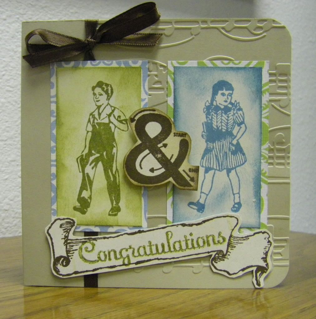
This past week I created two cards I am pretty happy about. I had a concept in my head for each and I was able to actualize it which isn't always how it works for me (I wish it was the norm!). I set myself another challenge as well. I have all these lovely kits I have stockpiled because I am a hoarding nut. It is embarrassing to admit my problem, but isn't that the first step? Hello my name is Shay and I am a hoarder of all craft supplies. I decided enough is enough (plus I am running out of room), so I thought I would break into my Scarlet Lime kits and use those to create my cards.
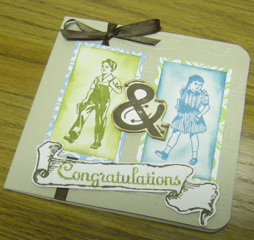
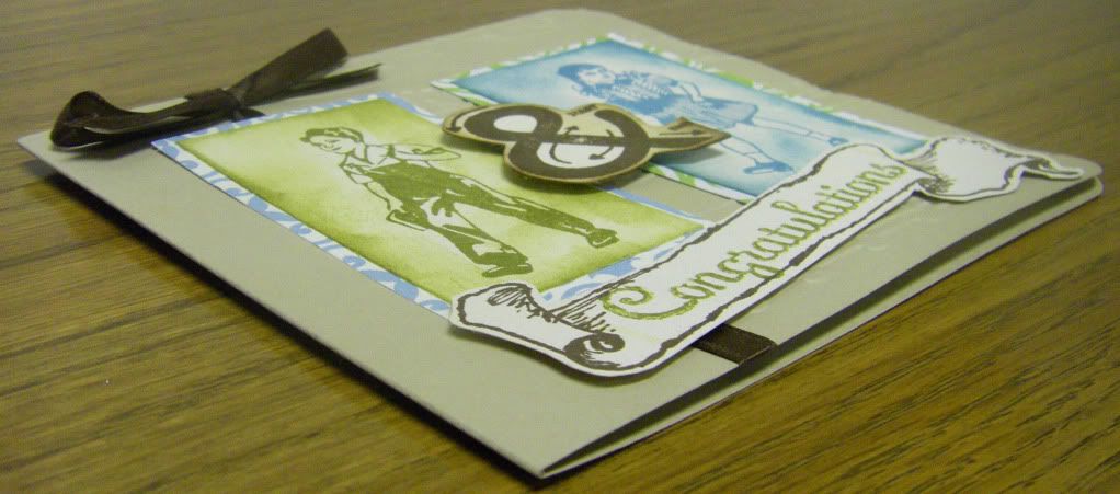
After looking through them I decided on a kit with lovely limes and turquoises for the wedding card and then I chose another with bright vibrant colors with a touch of black for my friend's birthday card. I began on the wedding card on Sunday evening with a great idea to use my vintage boy and girl and the ampersand stamps from Studio Calico (sadly they are all retired now). I was happily adding patterned paper and rub-ons from my Scarlet Lime kit (horrible hoarding admission time: that was the first time I had used a rub-on although I have bought more than a few over the years) when I decided my card-base was all wrong. So Monday night I went with a more basic card-base and set the other aside for future use. I think all turned out well with the card although it may be cleaner than my natural inclination.
Last night I knew I had to make a card for a friend's birthday which is this upcoming weekend and needed to get in the mail pronto. I knew I wanted to use some of my Kenner Road stamps for a vintage look (and they are gorgeous!). I remembered seeing some wonderful projects that Katie Watson created whilst on the Kenner Road design team back in October 2009 and they proved to be an inspiration for the card I made. The other inspiration for me is one of my favorite, favorite cardmakers of all time: Betsy Veldman.
Now I didn't look at either of my inspirations when I was actually making the cards, but I know these were the visual references flashing in my head:
Katie Watson (birdhouse with stamped scallop--genius!)
Betsy Veldman (strip of background behind focal image which I began with and then because an empty card felt well empty I went for more and more!)
Here is the card I created (front and then lastly the inside):
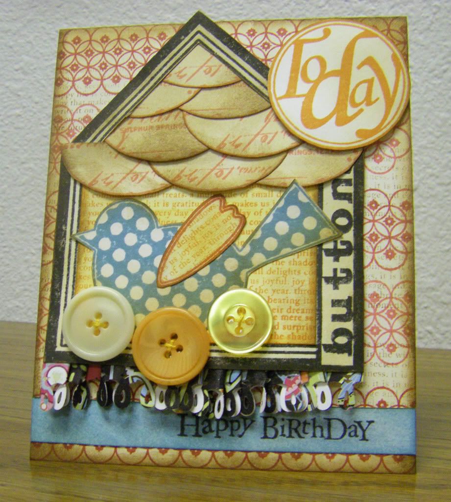
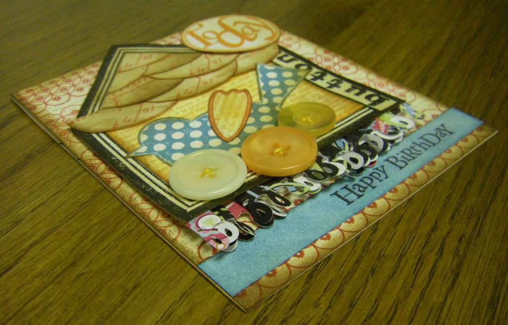
A lucky choice of adding the buttons around the that adorable bird stamp makes it took a bit like a nest to me. Another lucky choice was "ruffling" up a strip of punched patterned paper which just wasn't working before. I learned the basic technique in a Basic Grey card class I took locally (you place a strip of adhesive on the backside of a long strip of paper and then pleat--fold--the paper onto itself which remains in place because of the adhesive. The smaller the pleat, the longer the paper needs to be) and I thought why not try it with the patterned paper I had punched? It worked out just right--adding interest, flair and some texture and I even like that a bit of the white from the back peeks through.
Gypsy Bird Card
After looking through them I decided on a kit with lovely limes and turquoises for the wedding card and then I chose another with bright vibrant colors with a touch of black for my friend's birthday card. I began on the wedding card on Sunday evening with a great idea to use my vintage boy and girl and the ampersand stamps from Studio Calico (sadly they are all retired now). I was happily adding patterned paper and rub-ons from my Scarlet Lime kit (horrible hoarding admission time: that was the first time I had used a rub-on although I have bought more than a few over the years) when I decided my card-base was all wrong. So Monday night I went with a more basic card-base and set the other aside for future use. I think all turned out well with the card although it may be cleaner than my natural inclination.
Last night I knew I had to make a card for a friend's birthday which is this upcoming weekend and needed to get in the mail pronto. I knew I wanted to use some of my Kenner Road stamps for a vintage look (and they are gorgeous!). I remembered seeing some wonderful projects that Katie Watson created whilst on the Kenner Road design team back in October 2009 and they proved to be an inspiration for the card I made. The other inspiration for me is one of my favorite, favorite cardmakers of all time: Betsy Veldman.
Now I didn't look at either of my inspirations when I was actually making the cards, but I know these were the visual references flashing in my head:
Katie Watson (birdhouse with stamped scallop--genius!)
Betsy Veldman (strip of background behind focal image which I began with and then because an empty card felt well empty I went for more and more!)
Here is the card I created (front and then lastly the inside):
A lucky choice of adding the buttons around the that adorable bird stamp makes it took a bit like a nest to me. Another lucky choice was "ruffling" up a strip of punched patterned paper which just wasn't working before. I learned the basic technique in a Basic Grey card class I took locally (you place a strip of adhesive on the backside of a long strip of paper and then pleat--fold--the paper onto itself which remains in place because of the adhesive. The smaller the pleat, the longer the paper needs to be) and I thought why not try it with the patterned paper I had punched? It worked out just right--adding interest, flair and some texture and I even like that a bit of the white from the back peeks through.
Thank you for calling at the Hall! I hope you enjoyed today's cards.
Boy & Girl Card
Supplies:
Stamps: Vintage Boy, Vintage Girl and Ampersand, Studio Calico; Banner (from Narrative Elements set), Inque Boutique; Congratulations (from Darcy collection), Anna Griffin
Inks: Walnut Stain, Peeling Paint and Broken China, Tim Holtz Distress Ink by Ranger Industries
Cardstock: Sand and Earthstone, Neenah Papers
Patterned Papers: Beach Caribe and Cantando (from Canta Collection), GCD Studios
Embossing Folder: Allegro, Cuttlebug by Provo Craft
Other: Crop-A-Dile Corner Chomper, We R Memory Keepers; 1/4" Ribbon, Offray; Dimensional Foam Adhesives; Cuttlebug, Provo Craft
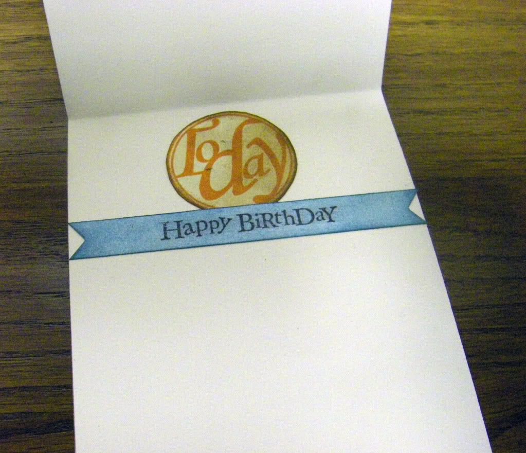
Gypsy Bird Card
Supplies:
Stamps: Collage Bird, Vintage Seal, Today Circle and Button Card Trio, Kenner Road; Background Basics: Diamonds and Background Basics: Text Style, Papertrey Ink; Happy Birthday (from Greetings Peg Stamp Set), Inkadinkado
Inks: Black Soot, Vintage Photo, Broken China, Fired Brick, Spiced Marmalade and Worn Lipstick, Tim Holtz Distress Inks by Ranger Industries
Cardstock: White, Georgia-Pacific; Recycled 100 Natural White, Neenah Papers
Patterned Paper: Deep Black Patch (from Nancy Jane Collection), Adornit Carolee's Creations
Punch: Loop Border Punch, Martha Stewart
Other: Embroidery Floss, DMC; Buttons, from Scarlet Lime kits; Dimensional Foam Adhesives
April 12, 2010
Marriage a la TV
Does anyone else watch "The Marriage Ref"? I watch already aired shows on demand and find it both fascinating and funny. I don't watch all the much reality television with the exception of cooking shows, decorating shows, craft shows (when I can find them--they have gotten scarce) and marathons of "Project Runway" (I guess I watch more than I thought!). I suppose I like the absurdity of this show. Three disparate celebrities (as we all know celebrities are well known for their solid and healthy relationships) discussing and judging quirky issues married couples have (like a wife keeping the prosthetic leg of her deceased husband in the closet she shares with her current husband or a husband stuffing his beloved dog and placing him in a shrine built in their house to his wife's horror) whilst sparks fly between the couples, celebrities and ref. Good wholesome fun!
Now onto something completely unrelated! Here is a birthday card I made for a cousin of mine. The butterfly by Unity Stamp Company (from one of the kit of the months--great deal) I had left over from ATC's I made that month and was the beginning piece of the card.
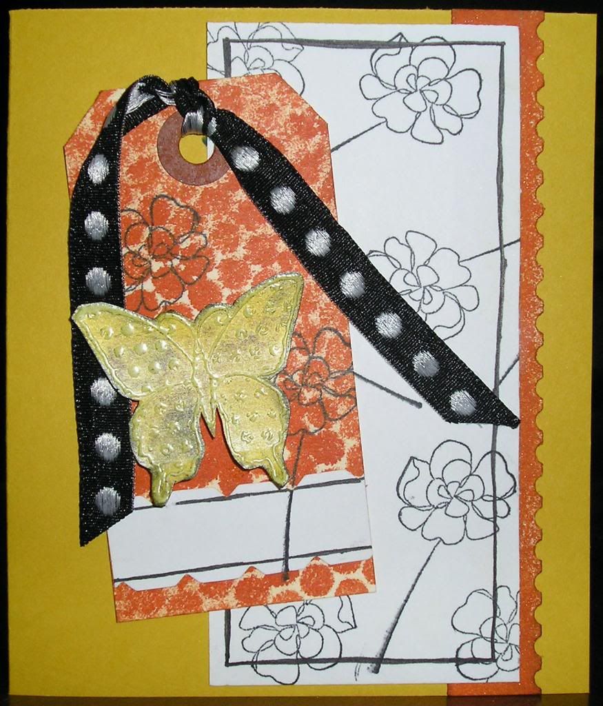
Bright Butterfly Card
Supplies:
Stamps: Butterfly (from KOM-9: Friendship. Love. Miracles set), Unity Stamp Company and Flower (from Botanical Blooms set), Stampin' Up!
Cardstock: White, Georgia-Pacific; Crushed Curry, Stampin' Up!
Ink: Black, Marvy Matchables; Walnut Stain, Tim Holtz Distress Ink by Ranger Industries
Sprays/Color Washes; Mango Lemonade, Memory Mists; Terra Cotta, Tim Holtz Color Wash by Ranger Industries
Border Punch: Postage Stamp, EK Success
Paint: Metallic Pearl White, Folk Art by Plaid
Other: Clear Embossing Powder, Ranger Industries; Notch Decorative Scissor, Fiskars; Ribbon; Manilla Tag; Seguin Remnant
April 4, 2010
Blog Makeover A
I will not admit to the exact amount of time I spent fiddling around with my new header and tweeking the design of the blog because upon seeing the changes you will not understand how it took as long as it did. Then again it took me 2 hours to make a salad for dinner tonight so perhaps that will give a glimpse into my world (to redeem myself a little I did make a carnivore and vegan version of the salad and it was met with approval by both camps).
I do wish to mention where I got all of the gorgeous brushes I used for the header (although truthfully my header is a poor example of the beauty of these designs that Rhonna Farrer designed. I will probably be continuing to make new headers until I love my header). I have written of House of 3 before, but I don't think I can heap enough praises upon the ladies of House of 3. I could happily buy every product at House of 3 and they also have a great live webshow every Wednesday. Okay, enough pitching. Go and find out on your own if you like and start playing around with brushes (very addicting).
Have a brilliant night and thanks for calling at the Hall.
April 2, 2010
Christmas in April?
Hello there everyone. An annoying cold has taken up residence at my household for the last week and more. I hope everyone else is in fine health because this cold is obnoxious! This means I have done no creating whatsoever this past week although I did get into my studio last Saturday and did some much, much needed cleaning up. Anyone else make a huge mess in their studio...perhaps to the point it may be condemnable? That is me. I will pull out this and that until I have to make a little patch of workspace on my tables (yes, tables as in two nice sized work surfaces and I still clutter it all up). Anyway, I am trying to reform. No, really I am. This also means buying less. This is harder than keeping my studio clean because I LOVE buying new stamps, papers, buttons, tools, punches, embossing folders, dies and the like. It pretty nearly kills me to limit myself like that. Anyone else have this problem? Well, space limitations and budget don't seem to like my buying compulsions one little bit so there you have it. A positive outcome of less buying is that I will have to rediscover what I already have. I am sure like me many of you have a lot too. It is time I use what I have and become more creative. If anyone has been facing this dilemma, please share what you have done and how it has effected your creating.
Anyway, I thought I would share a Christmas card (the only Christmas card I made in 2009 actually) I made with you. All the elements were leftovers from my Holiday Cookie Books. Eskimo Kisses by Basic Grey was the first inspiration for the Cookie Books and inspired the colors and products used. Don’t you love that gingerbread man? That was what sold me on the Holiday Button Bits by Papertrey Ink although there are many adorable images. I wonder if they have a Holiday Button Bits II if they will include a gingerbread house? Wouldn’t that be irresistible?

The details:
Not My Gumdrop Buttons! Card
Supplies:
Stamps: All from Holiday Button Bits, Papertrey Ink
Inks: Dark Chocolate, Papertrey Ink; VersaMark, Tsukineko; Tim Holtz Distress Inks
Cardstock: Kraft, Papertrey Ink; Earthstone, Neenah Papers
Patterned Paper: Eskimo Kisses (6x6 size), Basic Grey
Border Punches: Gingerbread Man, Martha Stewart; Petals, EK Sucess
Buttons: Holiday Mix, Papertrey Ink
Twine: Martha Stewart
Thanks for calling at the Hall. Have a joyous day!
Anyway, I thought I would share a Christmas card (the only Christmas card I made in 2009 actually) I made with you. All the elements were leftovers from my Holiday Cookie Books. Eskimo Kisses by Basic Grey was the first inspiration for the Cookie Books and inspired the colors and products used. Don’t you love that gingerbread man? That was what sold me on the Holiday Button Bits by Papertrey Ink although there are many adorable images. I wonder if they have a Holiday Button Bits II if they will include a gingerbread house? Wouldn’t that be irresistible?
The details:
Not My Gumdrop Buttons! Card
Supplies:
Stamps: All from Holiday Button Bits, Papertrey Ink
Inks: Dark Chocolate, Papertrey Ink; VersaMark, Tsukineko; Tim Holtz Distress Inks
Cardstock: Kraft, Papertrey Ink; Earthstone, Neenah Papers
Patterned Paper: Eskimo Kisses (6x6 size), Basic Grey
Border Punches: Gingerbread Man, Martha Stewart; Petals, EK Sucess
Buttons: Holiday Mix, Papertrey Ink
Twine: Martha Stewart
Thanks for calling at the Hall. Have a joyous day!
March 23, 2010
Trying Out a Different Style
I have an oldie for you today. This was me highly inspired by Kristina Werner's (note the white faux stitching, rounded corners and Kraft cardstock) and Dawn McVey's (note the border on the focal layer) clean styles. I love how their cards turn out, but am not sure how much I like my interpretation of their styles. Am I really a clean and graphic girl? No, I don't think so. So it is a bit off.
I think this was also a "quick" card for me. I believe I have mentioned before I am a s-l-o-w crafter. I rarely finish anything in a class (I tend to leave things unfinished to complete later), I can spend hours on a single card (people would be mystified if they knew how long it can take) or even do parts of a card over time if there is not a specific occassion (one of the reasons I like having someone in mind when I make a card). Seriously, if a card takes under an hour to create (including fumbling around with ideas and products) I am thrilled. I am feeling like a crafty speed demon.
Without further ado here is the card:
Thanks for stopping by the Hall!
"Quick" Inspired Birthday Card
Supplies:
Stamps: Stampin' Up!
Ink: Rich Razzleberry, Stampin' Up!; Fresh Snow, Papertrey Ink
Cardstock: Rich Razzleberry, Stampin' Up!; Kraft, Papertrey Ink; White, Georgia-Pacific
Border Punch: Apron Lace, Fiskars
Other: Signo White Gel Pen Broad Point, Uni-Ball; Crop-A-Dile Corner Chomper, We R Memory Keepers; Copper Mini Brad
Leaping Lords!
I have been sucked into the land of pretty nosegays, silken slippers, dashing lords, coy misses, noble gentlemen, wicked rakes, dazzling balls, careful courtships, dastardly villians, dangerous duels and simpering mamas...I have been reading Regency romances. Sadly, the Regency romance has become a bygone chronicle of a bygone era--both the era it focused upon and also the era when the Regency romance sub-genre flourished. It may be the fact that I used to read through these little gems when I was young and impressionable or that my favorite book of all time is Pride and Prejudice (and the 1995 adaption starring Jennifer Ehle and Colin Firth is pretty near the most perfect miniseries ever, although I think my sister would now say that the recent adaptation of Emma starring Romola Garai and Jonny Lee Miller gives it a run), but I have a deep affection for them no matter if they are fluffy or not. Of late, I have found myself reaching for a Regency rather than my stamps.
The picture at left is of one of the books I recently read and it was pretty good. What I most like about Regencies is a sense of innocence, hope and faith that is a common thread in them all. There is a happy ending. The heroine no matter how poor, plain or silly finds true love. The villian is bested. And all in a setting which I can't help but be drawn to. Of course there are Regencies that are excellent by any standards with superb writing, deft character development and depth and those I especially treasure. Off hand, I recommend authors like Mary Balogh, Carla Kelly, Mary Jo Putney, Susan Carroll, Jo Beverley and Loretta Chase (all of which still write books--Carla Kelly writes for Harlequin which still produces Regencies, Susan Carroll writes historical fiction with a lot of romance and the rest write historical romances). You can purchase out-of-print Regencies either used online, at used bookstores, or some of the authors mentioned are now having their classic Regencies reissued.
Anyone else have periods where reading captures their fancy? If so, what do you enjoy reading?
March 12, 2010
Trio of Cards
I have been quite remiss with my blog this week. So to make up for it I am going to post three cards in this post. You will notice a theme as they all use Basic Grey's Origins line. Yes, that line of paper once again. As someone who hoards patterned paper (and nearly everything else) I can stretch the use of it like no one's business. Think of me as the Ebenezer Scrooge (only that I like to make my money stretch not that I say "bah humbug!" a lot or that I have a nasty demeanor) of crafting--I reuse, recycle and repurpose. I have a feeling that one reason I love stamps so much is I don't feel I am losing anything by using them. They are reusable over and over again unlike paper, ribbon, stickers, rub-ons, buttons and the like. I use those sparingly. In fact I rarely use patterned paper (and stickers even more rarely) so all these Basic Grey Origin cards are a lark for me. I truly am trying to reform.
The next card is using the Basic Grey Origins line to make a feminine card (I know you are saying, "At last! Does she every do feminine cards?). I can't claim any part in the card design as I started the card in that Basic Grey card class so it is all Basic Grey, but I did pop up the floral cardstock sticker and I added the butterflies all on my own (wow, am I original!). Wednesday night, I thought the card was sort of shoddy and I felt I had really "cheated", but I felt better about the card in the light of day.
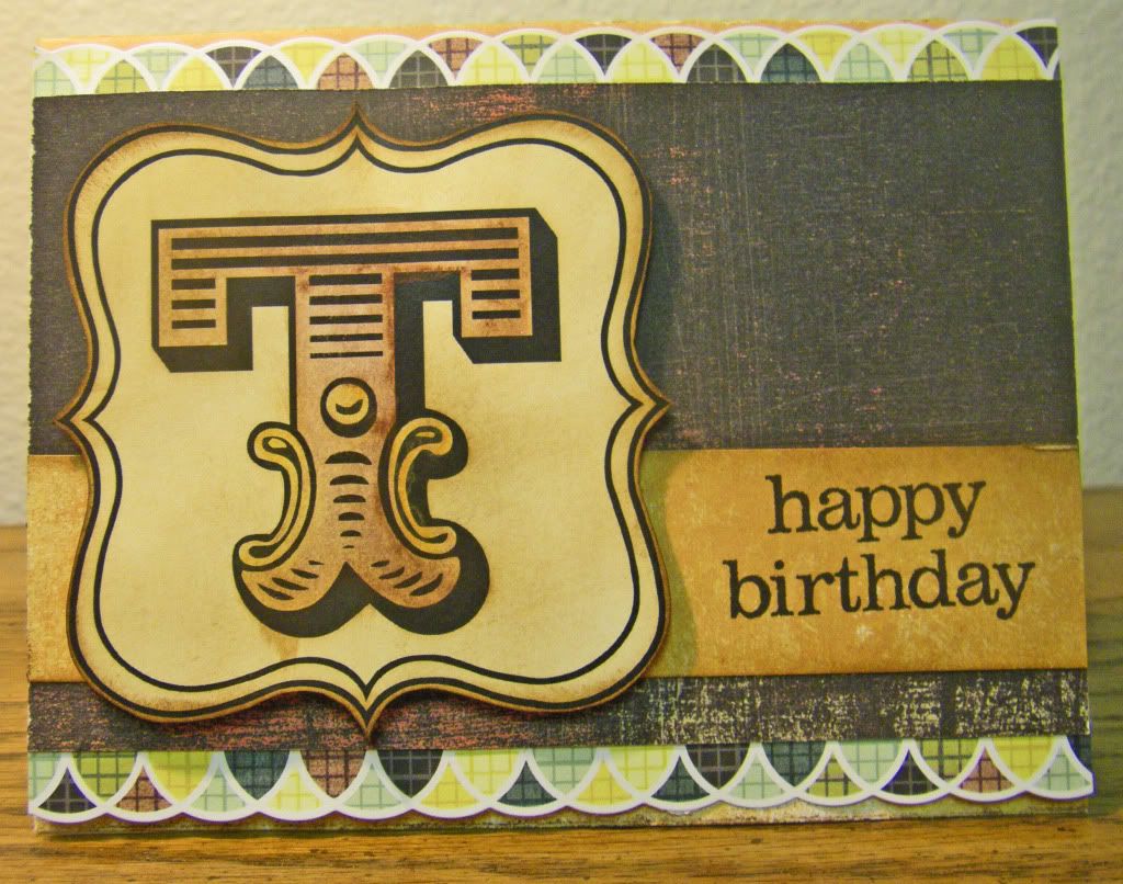
Lastly, is another masculine card using the Basic Grey Origins line and another amazing printable by House of 3, this time from the Monogram Printable Kit. Each letter is different and can be used to personalize a card or gift or spell out words or names to make banners, scrapbook titles and any other thing your mind can dream up. Of course you can print the Monograms onto whatever paper you want, but I went with a natural white cardstock which I then distressed and also watercolored with some truly cool water-soluable wax pastels by Caran d'Ache which Donna Downey introduced to my friend in a class she took with her who then introduced them to me in a class I took with my friend (talk about confusing!). In fact in my draft posts I started writing about the class my friend taught, my awesome friend and these water-soluable wax pastels so one of these days hopefully I will post it.

I hope you have enjoyed these cards and thanks so much for visting the Hall!
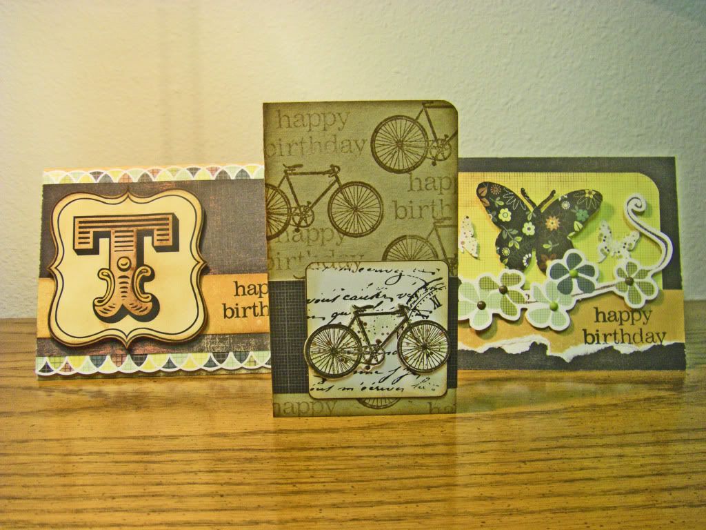
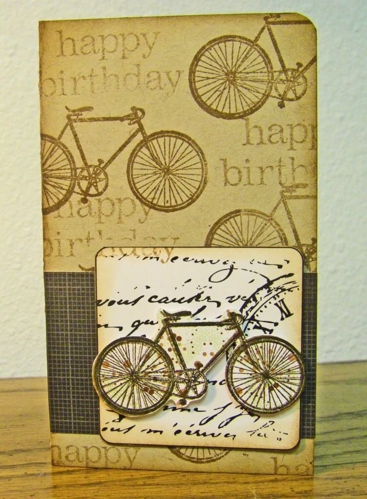
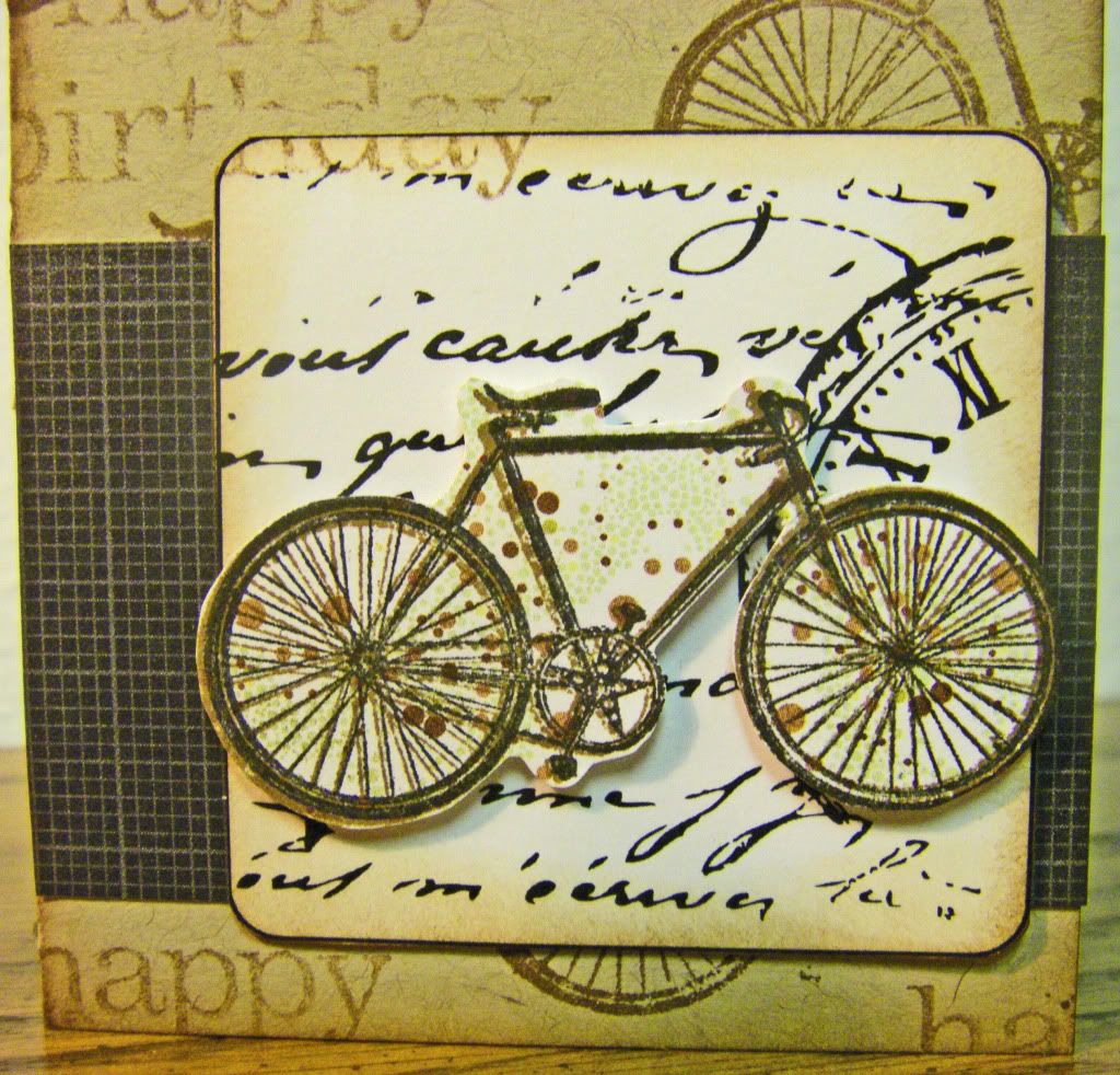
I Want to Ride My Bicycle Birthday Card
Supplies:
Stamps: Bicycle, Studio Calico; Happy Birthday, not sure as any label has been destroyed (If anyone knows, please tell me)
Inks: Vintage Photo, Tim Holtz Distress Ink by Ranger Industries; Jet Black, Archival Ink by Ranger Industries
Cardstock: Kraft, Papertrey Ink; White, Georgia-Pacific
Patterned Papers: Origins line, Basic GreyDigital Element: Decorative Square (from Magnet Board Project Kit), House of 3
Other: Crop-A-Dile Corner Chomper, We R Memory Keepers; stampin' dimensionals, Stampin' Up!
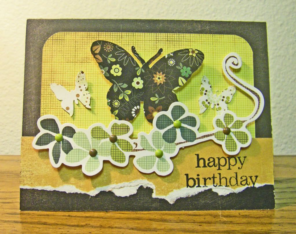
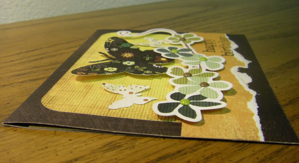
Madame Butterfly Birthday Card
Supplies:
Stamp: Happy Birthday, not sure (see note above)
Ink: Black, Archival Ink by Ranger Industries
Patterned Paper: Origins line, Basic Grey
Cardstock Sticker: Origins line, Basic Grey
Punch: Royal Butterfly, Martha Stewart
Die: Combo Butterfly, Cuttlebug by Provo Craft
Brads: Eerie line, Basic Grey
Other: Cuttlebug, Provocraft; Crop-A-Dile Corner Chomper, We R Memory Keepers; stampin' dimensionals, Stampin' Up!
Fits You to a "T" Birthday Card
Supplies:
Stamp: Happy Birthday, not sure (see note above)
Inks: Vintage Photo, Tim Holtz Distress Ink by Ranger Industries; Jet Black, Archival Ink by Ranger Industries
Cardstock: Recycled 100 Natural White, Neenah Paper
Patterned Papers: Origins line, Basic Grey
Cardstock Sticker: Origins line, Basic Grey
Digital Element: T Monogram (from Monogram Printable Kit), House of 3
Other: Burnt Siena and Golden Cadmium Yellow, Neocolor II Water-Soluable Wax Pastels by Caran d'Ache; stampin' dimensionals, Stampin' Up!
Subscribe to:
Posts
(
Atom
)