Welcome, welcome my friends! Thank you for joining me on this new adventure. When I thought about this idea I knew it was so right. Without further ado, I share with you my first blog feature:
Do you have the blues when trying to come up with cards for guys? Stumped on how to have fun making something for the opposite sex? How do you use your beloved supplies to create cards for the males in your life?
I wonder these things too and thought why not devote a day each week to making masculine cards (and possibly projects)?
My number one reason for making masculine cards are for birthdays so at first that is what I will mostly be focusing upon, but should anyone be interested in exploring other occasions in depth, give me a holler.
I will be using three categories of products:
- Hear Me Roar = male gender specific full of good ol' boy stereotypical guy goods like camping, fire, Western gear, trucks, motorcycles, trains, tools, sports, hunting, video games, comic books, boats, camouflage, rope and the like.
- Easy Going = gender neutral designs which could include chevrons, stripes, triangles, wood grain, nature, maps...most shapes are great here.
- So Secure I Wear Pink = not really either of the above and may involve (gasp!) pink, glitter and hearts because male cards are just not challenge enough for me...haha. Seriously, some of us have supplies that may not translate immediately to masculine cards, but that shouldn't mean the need to spend more money to create guy friendly cards. With some ingenuity we can use what we have!
For the inaugural Man Oh Man Monday, I chose to use a color scheme informed by the
Moxie Fab World's Trigger Tuesday: Pattern Play:
an embossing folder, dies and stamps along with
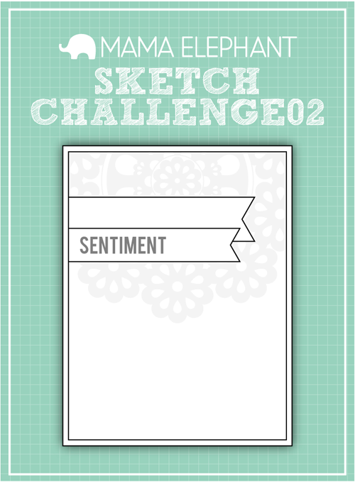
Mama Elephant's Sketch Challenge 02:
I would classify the products used as Easy Going.
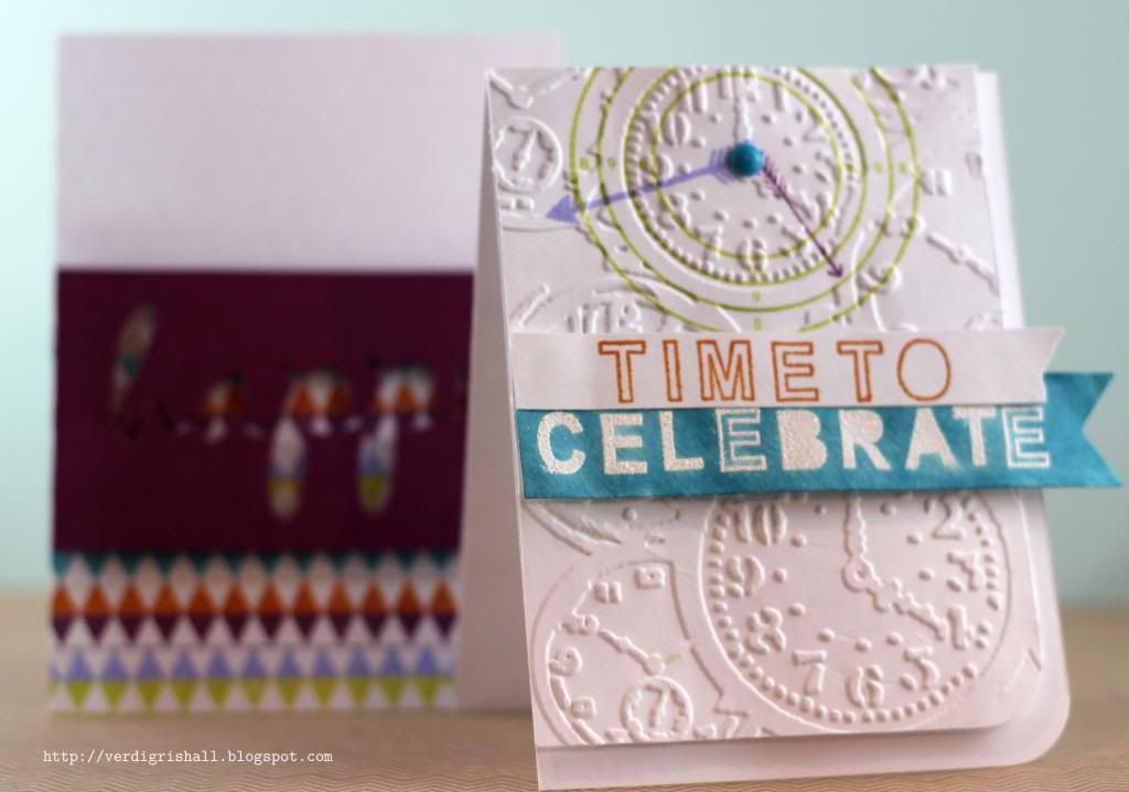
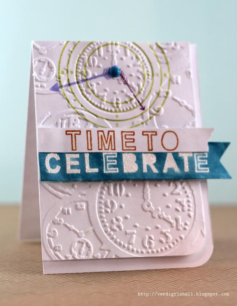
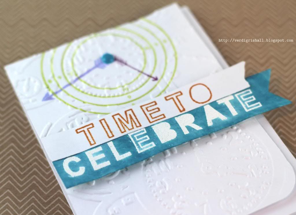
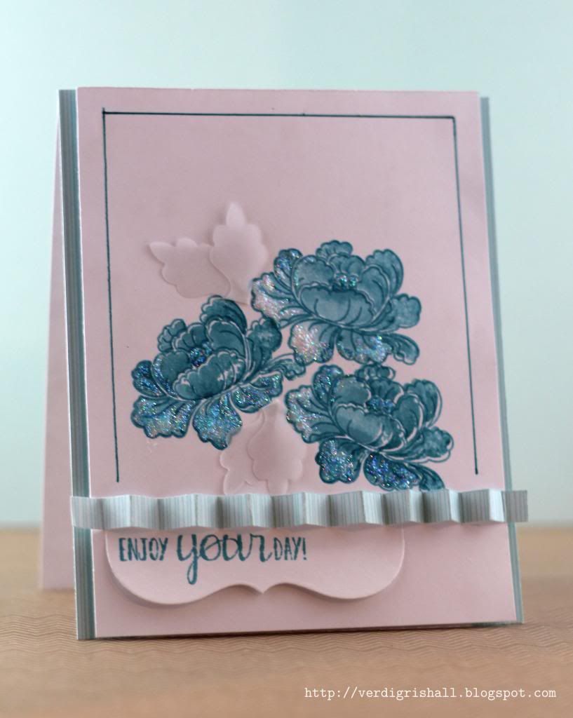
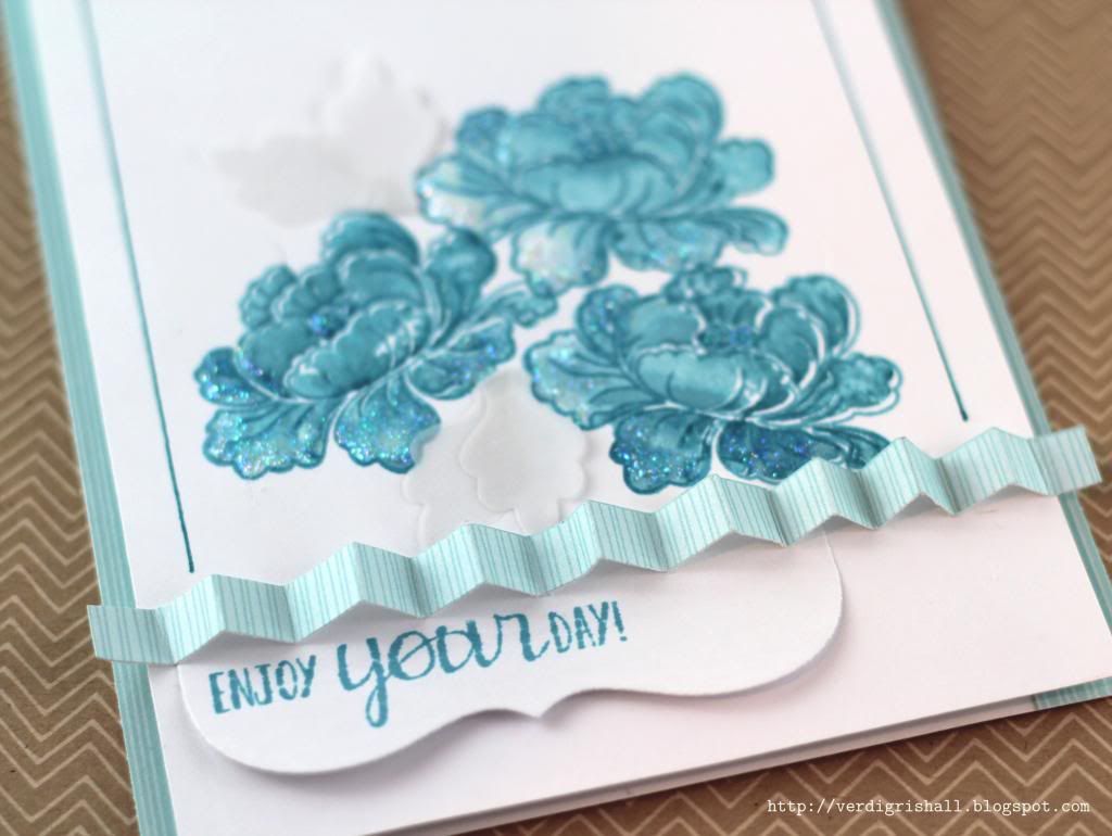
Card No. 1:
I used the bull's eye and an arrow from
On Target and an arrow from
Trifecta to create an interesting clock to play with the sentiment I stamped using
Midnight Letters. I found that the bull's eye fit perfectly into one of the clock faces found in the
Pocket Watches texture fade (aka embossing folder) by Tim Holtz Alterations/Sizzix. So thrilled with the discovery.
The dies are from a newer purchase from Lifestyle Crafts. I chose the
Tape It Kit collection because there were so many shapes that will work for any occasion, age, style or gender.
Heat embossing is always a great addition to a card. I chose white on this card.
The banner is colored using my ink pad as it was the exact color I wanted. I simply used the ink pad to paint on the color and since it was Distress Ink I lightly misted the banner with water to help even out the color making sure to wipe off the color from the white embossed letters.
After adhering the embossed panel onto the white card base with dimensional adhesive I added the last finishing touch with an enamel dot for the center of the clock where the arrow hands met.
Although I used this card for a birthday it would be equally as good for a congratulations of some sort...graduation, getting a job, anniversary, starting a business, promotion, closed on a house, or even climbing Mount Everest (if someone I knew climbed Mount Everest they deserve a card in the very least is all I am saying) for instance.
Challenges Met:
Mama Elephant Sketch Challenge 02;
Moxie Fab World's Trigger Tuesday: Pattern Play
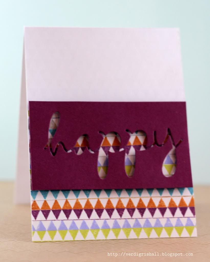
Card No. 2:
Using the Mama Elephant Sketch No. 2 and flipping it upside down, this card began all about color and pattern...triangles in this case.
Trifecta is an *awesome* stamp set because it is so flexible. Using the small triangle border stamp I stamped it once in each of my 6 colors. I then cut each line of triangles into a strip. Using alternating strips I made a new diamond pattern onto my white card base. The options here are limitless.
Surprisingly, here is where things got tricky. At this point I was thinking I was going to use another banner. I wanted a specific birthday sentiment, but I didn't really have one from Mama Elephant (yet) and I had already used Midnight Letters in my last card (several cards recently actually) so I searched through my various stashes for an alternative. Finally I hit upon using my happy die from Papertrey Ink to make a negative die cut. The idea of which was pushed into my head by Moxie Fab World's recent
The Emphasize the Negative Challenge. Of course I adhered the happy negative with foam adhesive. I love how the colors and design peek through the word.
By the way, inside the card I stamped "birthday!" to finish off this card, but if you wanted to make this into another sort of card you could put any sentiment in that fit your circumstances...even the sadly neglected Arbor Day.
Challenges Met:
Mama Elephant Sketch Challenge 02;
Moxie Fab World's Trigger Tuesday: Pattern Play;
Moxie Fab World's The Emphasize the Negative Challenge
MOMM Tips (I had no idea that was the acronym of Man Oh Man Monday...too funny):
MOMM Tip No. 1: Make it easy for yourself and use a versatile sketch/challenge. I love how classic Mama Elephant's sketch is. An added bonus is that using their sketch dictates I use some Mama Elephant products thus minimizing the stamps I need to shift through and decide upon. I can't tell you how much time I spend simply choosing supplies for a project. I also decided to use the colors from Moxie Fab World's Trigger Tuesday as another way to narrow down my choices. These colors are fun, fresh and quite cool.
MOMM Tip No. 2: Use texture on your card and break out your embossing folders. Many embossing folders have designs that work for guy or gal cards.
MOMM Tip No. 3: Go negative. Even dies with a little bit of a feminine look like the "happy" in Card No. 2 looks more graphic when only using the negative.
If you would like to play along leave a comment with a link to your creation(s). I am so excited to see whatever you make. Also, if you have any suggestions for products, inspiration, themes, colors, etc. please don't hesitate to leave me a comment.
Happy creating,
Shay.
P.S. If you want to see what I did with the positive of the happy die, please visit
The Aviary today at 8:00 am (central) for something with a feminine mixed media edge.
Supplies:
Card No. 1
Stamps: On Target, Midnight Letters and Trifecta, Mama Elephant
Ink: broken china, rusty hinge, shaded lilac and seedless preserves, Tim Holtz Distress Ink by Ranger; limeaid ice, Papertrey Ink; VersaMark, Tsukineko
Cardstock: white, Georgia Pacific
Other:opaque white embossing powder, JudiKins; Tape It Kit die collection, Lifestyle Crafts; Pocket Watches & Steampunk Set texture fades, Tim Holtz Alterations/Sizzix; Cuttlebug, Provo Craft; dimensional adhesive; Collectable Remarkable "Handsome" enamel dots, My Mind's Eye; Crop-A-Dile Corner Chomper, We R Memory Keepers; dimensional adhesive
Card No. 2
Stamps: Trifecta, Mama Elephant
Ink: broken china, rusty hinge, shaded lilac, seedless preserves and pumice stone, Tim Holtz Distress Ink by Ranger; limeaid ice, Papertrey Ink
Cardstock: white, Georgia Pacific; rich razzleberry, Stampin' Up!
Other: wonderful words die collection, Papertrey Ink; Cuttlebug, Provo Craft