April 26, 2010

Hero Arts Club: Engraved Daisies

I was going to go to sleep early Thursday night before last (April 15th)...honestly I was, but then I began casually flipping through some issues of Somerset Studio I hadn't read yet and it struck me that I needed to make something.  The following evening (Friday, April 16th) I had a Hero Arts Club meeting (a monthly occurance) and Jane, our organizer, leader and teacher (she does it all and is terrific!) sends us off after each meeting with stamped images to create with to bring back for show and tell the following month.  {A little plug now.  If you are in the San Antonio area, are interested in anyway in Hero Arts or stamping this monthly club is wonderful.  You'll want to contact Stamp Antonio for more information.}  I did make something our first month, but March no such luck which made me think I should do something for April's meeting.  As I always need cards I decided to make one (I was contemplating other projects like an Artist Trading Card). 

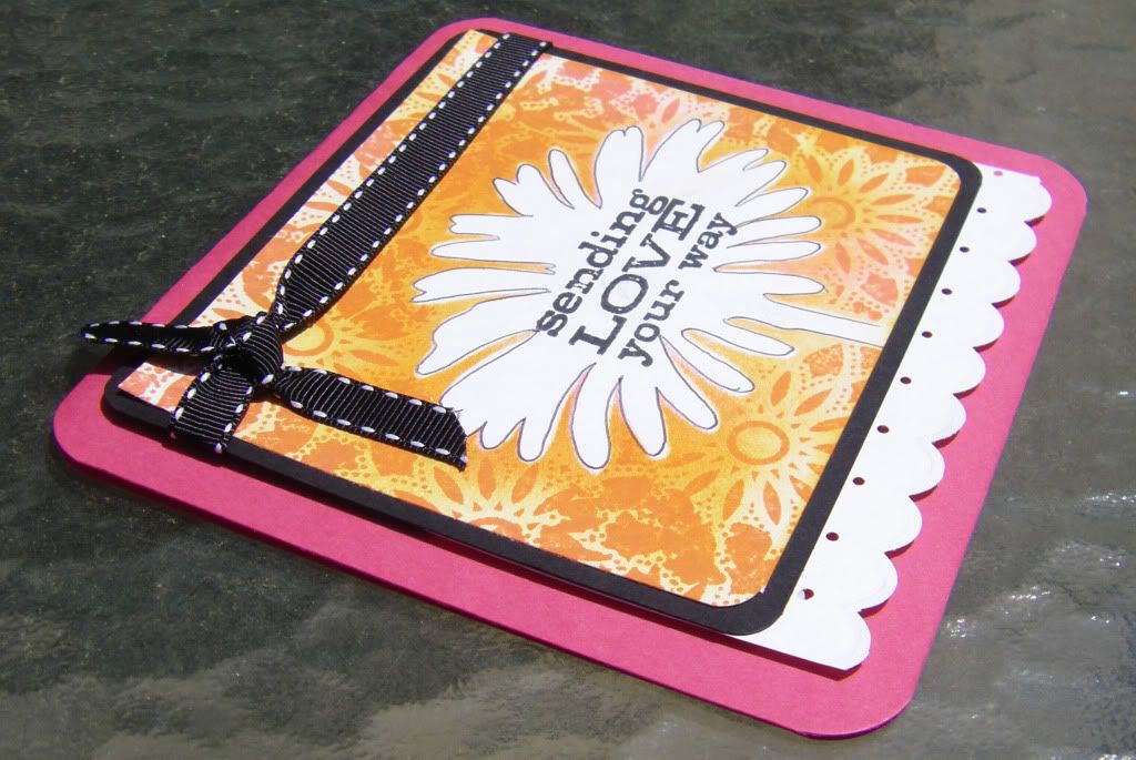
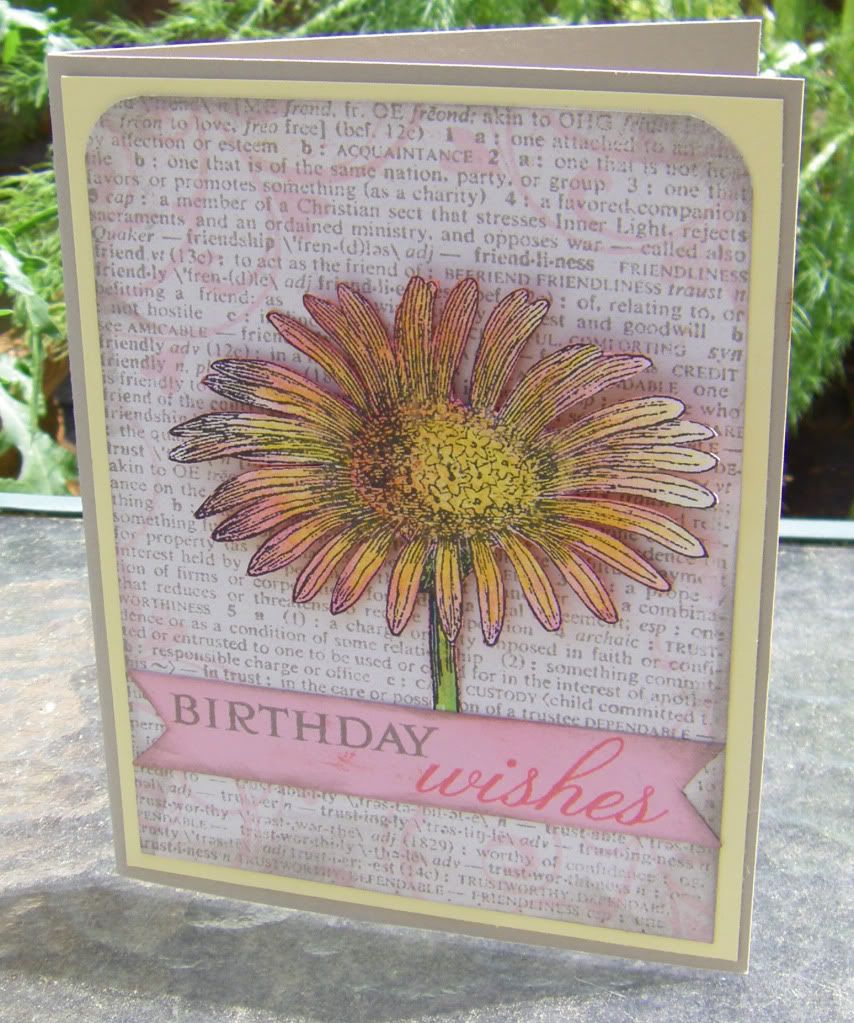
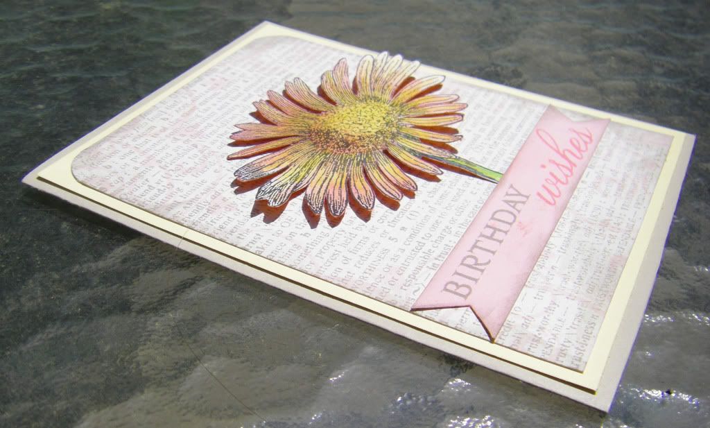
I began with coloring in the Engraved Daisy image Jane stamped for us with some colored pencils.  I cut it out and then decided I wanted to try using the reverse side as a mask and applied ink using my ink blending tool.  In that way I had the beginnings of two different cards.  The reverse image I made into a bright, more graphic card and the card I created for the flower image I made softer with a bit of a vintage vibe.

Without further ado the cards:


Thanks for calling at the Hall!

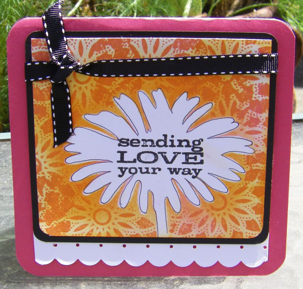
Sending Love Your Way Card
Supplies:
Stamps: Engraved Daisy (as mask), Starburst and Sending Love Your Way (from Tree, Birds and Messages set), Hero Arts
Inks: Black Soot, Spicy Marmalade and Worn Lipstick, Tim Holtz Distress Inks by Ranger Industries
Cardstock: Melon Mambo and Black, Stampin' Up!; White, Georgia-Pacific
Other: Crop-A-Dile Corner Chomper, We R Memory Keepers; Stiched Ribbon; Foam Dimensional Adhesives

Birthday Wishes Card
Supplies:
Stamps: Engraved Daisy, Heart Flourish and Friends Definition, Hero Arts; Birthday Wishes (from Giga Guide Lines set), Papertrey Ink
Inks: Pumice Stone (wonderful new color!), Worn Lipstick, Spun Sugar, Tim Holtz Distress Ink by Ranger Industries
Cardstock: Lemon Tart: Papertrey Ink; Earthstone and Sand, Neenah Papers; Pink
Other: Colored Pencils; Crop-A-Dile Corner Chomper, We R Memory Keepers; Foam Dimensional Adhesives

April 25, 2010

April's Papertrey Ink Blog Hop


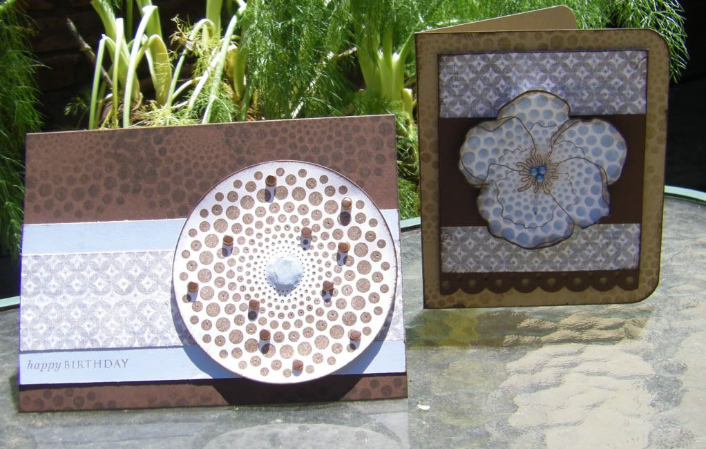
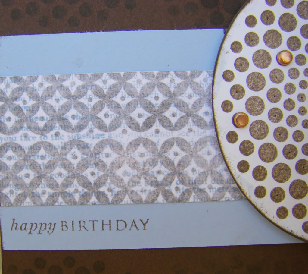
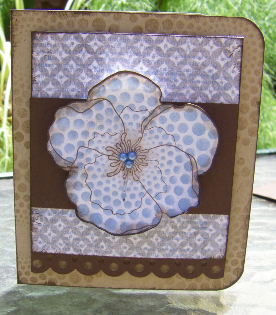
Hello and welcome fellow Papertrey Ink fans!  I am so glad to be participating in this month's blog hop (my second).  April's Blog Hop is all about using tissue paper.  I decided to use it in a similar way as Nichole Heady did with the faux silk technique.   I stamped a background using the Background Basics: Diamonds with Dark Chocolate ink and I stamped some white tissue paper using the Background Basics: Text Style with Spring Rain ink.  I crumpled up the tissue paper and then adhered it to the Dark Chocolate stamped background.  I thought it came out pretty cool.  Using this piece I decided to make a couple of cards--one masculine (honestly I couldn't resist!) and the other feminine.  I also decided to keep with the same colors and most of the same stamps (a good way to challenge myself to use stamp sets more creatively).  I am happy with how I decided to use Dot Spot on the feminine card and mean to do so more in the future.

Enough writing though (I can almost hear the sighs of relief), here are the cards:


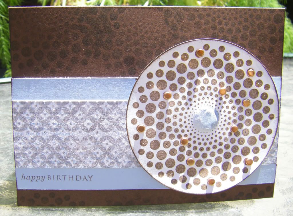
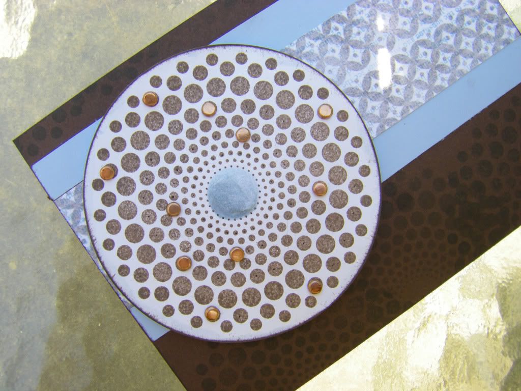
For the masculine card I did some subtle paper piercing and watercolored with the Spring Rain ink to create some interest in the center of the large Dot Spot image and also embossed the other side of the center so it popped out a bit.  Lastly I added random brads for a little more dimension:


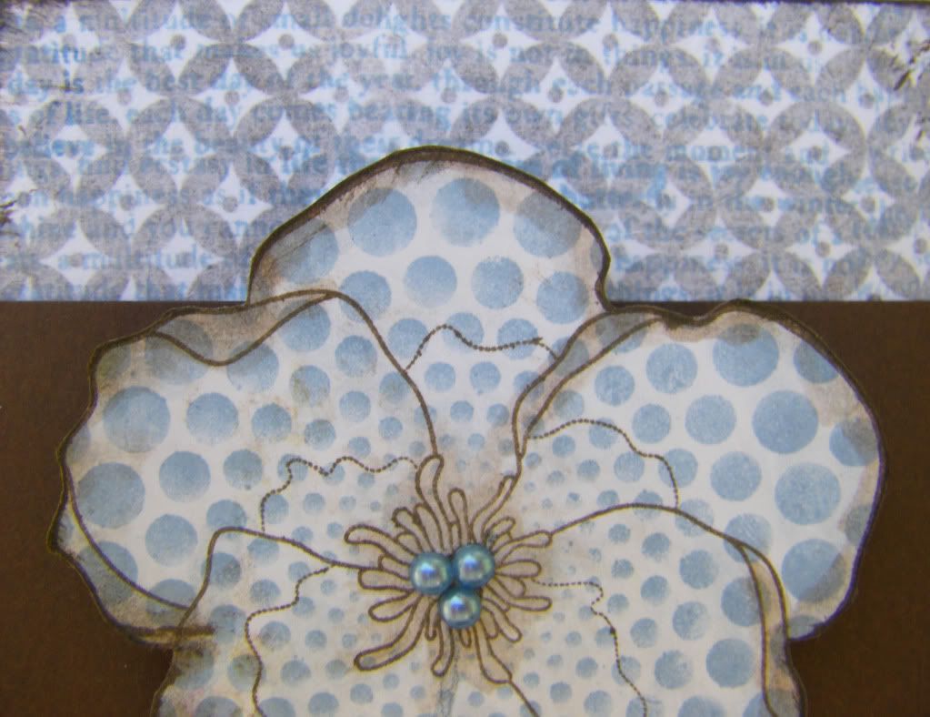
For the feminine card I stamped the violet over the large Dot Spot image and added a brown edge and center by using the Dark Chocolate ink with some water to paint it on.


I hope you enjoyed the cards!  I can't wait to see all the wonderful projects you all made.  Thanks for calling at the Hall.

Supplies:

Spotty Birthday Card
Inks: Dark Chocolate and Spring Rain, Papertrey Ink
Cardstock: Dark Chocolate and Spring Rain, Papertrey Ink; White, Georgia-Pacific
Other: White Tissue Paper, Papertrey Ink packaging; Copper Mini Brads; Foam Dimensional Adhesive 

Dotty Violet Card
Inks: Dark Chocolate and Spring Rain, Papertrey Ink
Cardstock: Kraft and Dark Chocolate, Papertrey Ink; White, Georgia-Pacific
Border Punch: Scallop Dot, Martha Stewart Crafts
Pearls: Denim, Kaisercraft
Other: White Tissue Paper, Papertrey Ink packaging; Crop-A-Dile Corner Chomper, We R Memory Keepers; Foam Dimensional Adhesive

April 23, 2010

Standouts

I recall mentioning using my Cricut and then setting a challenge for myself to use up all the shapes I had cut out to make cards last March (as in March 2009).  I really should do such a challenge again because I enjoyed making the cards quite a bit and felt a thrill of accomplishment (I may have a low threshold). 

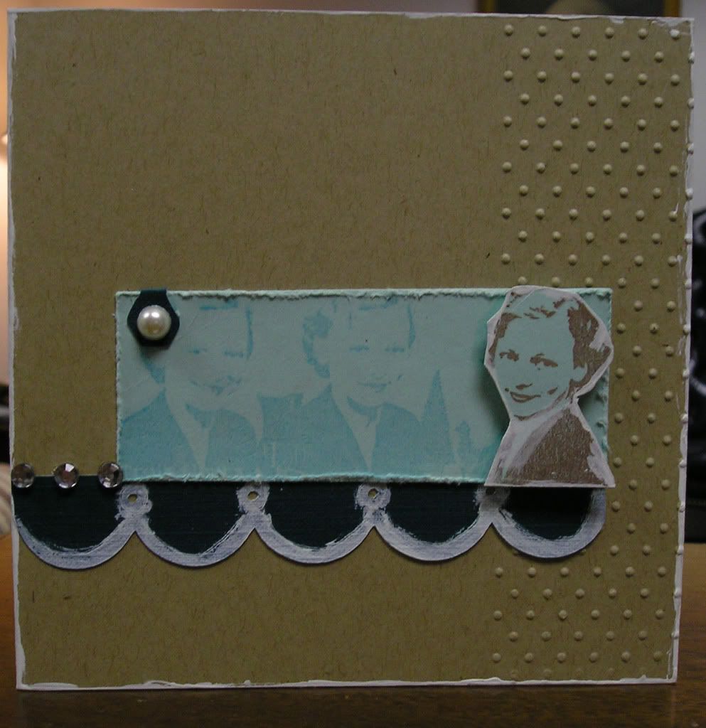
Here is another such card this one I used a stamp I love from Stampington & Company designed by Carin Andersson.  I believe at the time I was inspired by Heather Nichols to use kraft and white paint (I didn't have a good white ink at the time).  Of course my cards don't have her rustic elegance, but they didn't turn out too shabbily.


What came from the Cricut were the scallops and the tab thing.  I have no idea what the tab is really (maybe there is someone out there to enlighten me), but I used it as an embellishment. 

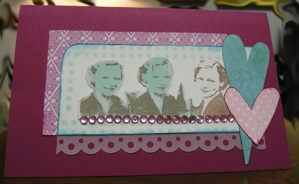
Another card I made the same time with the same stamp with slightly different colors:


Notice I used the rest of the Aqua Mist ladies from the first card to add to this one.  I was trying to be very thrifty and clever with my scraps.

The hardest part of blogging about older cards is trying to figure out what supplies I used. It is a bit of a crafting mystery I need to solve and I have to riffle around in the studio to find this stamp, this paint or that ink. Anyone else as mired in crafting puzzles?

Thank you for calling at the Hall!


The Standout Card
Supplies:
Stamp: Trio of Smiles, Stampington & Company
Inks: Amaretto Truffle Chalk Ink, Fresco by Stampa Rosa; Turquoise, Memories
Cardstock: Aqua Mist and Kraft, Papertrey Ink; Terrific Teal, DoubleMates by WorldWin Papers
Embossing Folder: Swiss Dots, Cuttlebug by Provo Craft
Craft Acrylic Paint: Warm White, Americana
Gems and Pearl: The Paper Company
Other: Cricut, Provo Craft; Tim Holtz Paper Distresser; Tonic Studios; Cuttlebug, Provo Craft; Dimensional Foam Adhesive


The Reverse Standout Card
Supplies:
Stamps: Trio of Smiles, Stampington & Company; Polka Dot heart (from little things set), urban lily;Motif on Long Heart (from Guide Lines set), Papertrey Ink; Border, Impress
Inks: Amaretto Truffle Chalk Ink, Fresco by Stampa Rosa; Turquoise, Memories; Aqua Mist, Papertrey Ink; Purely Pomegranate, Stampin' Up!; Bubblegum Pink, Marvy Matchables
Cardstock: Aqua Mist, Papertrey Ink; Purely Pomegranate, Stampin' Up!; White, Georgia-Pacific
Patterned Paper: 5th Avenue (from Tinsel Town collection), Pink Paislee; Vellum
Border Punch: Scallop Dot, Martha Stewart Crafts
Gems: The Paper Company
Other: Cricut, Provo Craft; corner punch;Tim Holtz Paper Distresser, Tonic Studios

April 15, 2010

The 14th of the Month

I love the 14th of the month for three reasons:
Last night also happened to be the live webshow of House of 3 too so I had my fingers in a lot of pies.  After watching the webshow I decided to chat with the ladies over at Kenner Road.  If you are intimidated by chats I can tell you that the monthly chat at Kenner Road (on the 14th of the month at 8 p.m. Pacific) is the place to introduce yourself to chat rooms.  The people are as sweet as a hot chocolate on a cold winter night.  Everyone is happy, helpful and friendly.  Plus kl, the woman behind Kenner Road, is just one of those people who creates joy whether it is in her own art, with her kits or in how she treats her customers.

After I chatted, did a little (too little for my liking, but there is such a concept as a budget--ugly, nasty word!) shopping and pined for a whole lot more, I made another card.  It came out a bit dark and full of grunge because it is yet another masculine card.  I am coming to believe I make more masculine cards than feminine which is odd when I come to think of it...no wonder I am trying to build up my Tim Holtz stamps and products and other stamps and products that work for guys/boys.  Thankfully, Papertrey Ink just addressed males in this month's release although unfortunately I can't buy any of it yet (budget rears its ugly, nasty head again). 

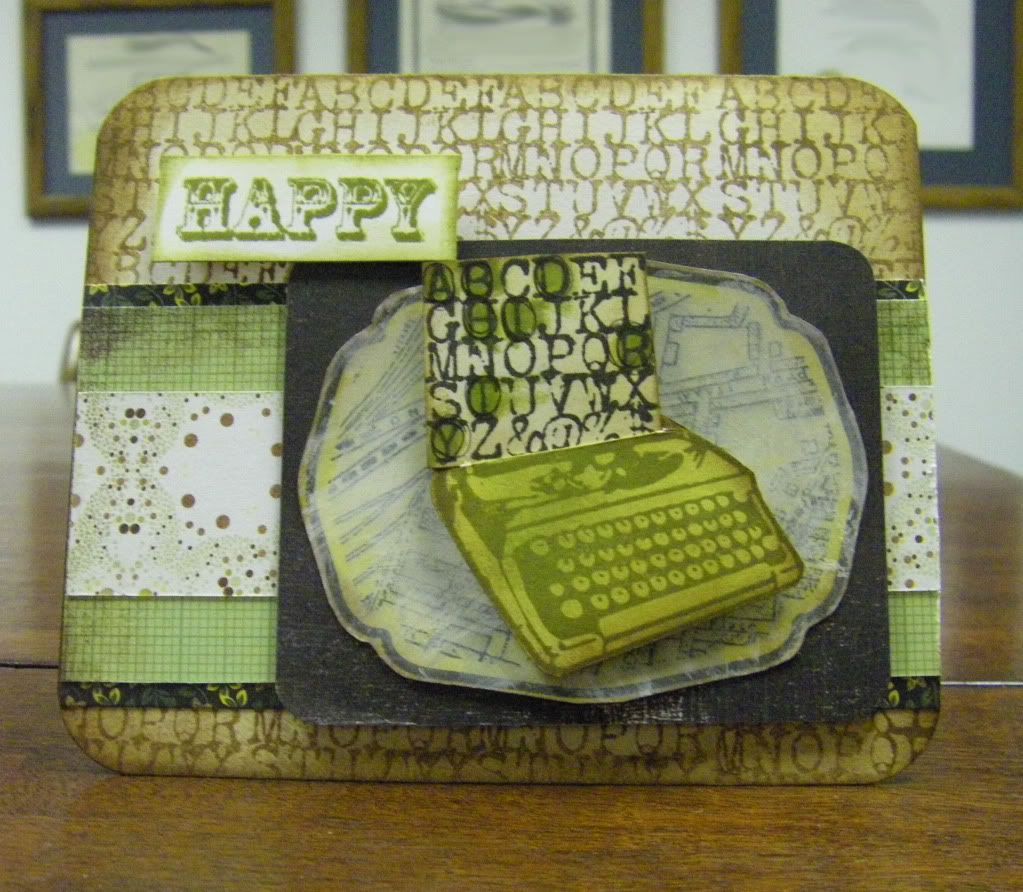
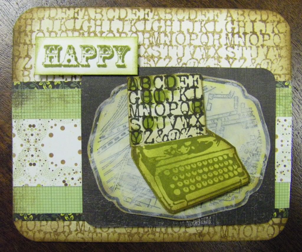
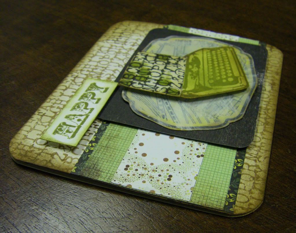
Anyway, there was a typewriter with a typewriter font alphabet block stamp set from Studio Calico I wished to use and I decided to keep with the whole Basic Grey Origins kick I have had all year (Heck, why break with the trend when I had made cards for this cousin's brothers and father with the Origins line already.  Surely he would wonder if his card didn't match--well, if he noticed such a thing).  I may have gone a little overboard with the distressing and the card is a bit busy, oh and the concept I had has to be explained for anyone to get it (Hint: notice which letters I highlighted on the "typwritten page" coming out of the typewriter as it actually spells out something even if the letters aren't in order for the word), but it's the thought that counts, right?


Thanks for calling at the Hall!

Typed Birthday Card
Supplies:
Stamps: Typewriter Duo and Vintage Map, Studio Calico; Happy (from Simply Stated set), Fancy Pants Designs
Inks: Black Soot, Vintage Photo, Peeled Paint, Mustard Seed and Crushed Olive, Tim Holtz Distress Inks by Ranger Industries
Cardstock: White, Georgia-Pacific; Earthstone, Neenah Papers
Patterned Papers: all from Origins collection, Basic Grey
Acrylic Craft Paint: Warm White, Americana
Other: Crop-A-Dile Corner Chomper, We R Memory Keepers; Dimensional Foam Adhesives

LinkWithin

Related Posts with Thumbnails