March 23, 2010

Trying Out a Different Style

I have an oldie for you today.  This was me highly inspired by Kristina Werner's (note the white faux stitching, rounded corners and Kraft cardstock) and Dawn McVey's (note the border on the focal layer) clean styles.  I love how their cards turn out, but am not sure how much I like my interpretation of their styles.  Am I really a clean and graphic girl?  No, I don't think so.  So it is a bit off. 

I think this was also a "quick" card for me. I believe I have mentioned before I am a s-l-o-w crafter.  I rarely finish anything in a class (I tend to leave things unfinished to complete later), I can spend hours on a single card (people would be mystified if they knew how long it can take) or even do parts of a card over time if there is not a specific occassion (one of the reasons I like having someone in mind when I make a card).  Seriously, if a card takes under an hour to create (including fumbling around with ideas and products) I am thrilled.  I am feeling like a crafty speed demon.    

Without further ado here is the card:


Thanks for stopping by the Hall!

"Quick" Inspired Birthday Card
Supplies:
Stamps: Stampin' Up!
Ink: Rich Razzleberry, Stampin' Up!; Fresh Snow, Papertrey Ink
Cardstock: Rich Razzleberry, Stampin' Up!; Kraft, Papertrey Ink; White, Georgia-Pacific
Border Punch: Apron Lace, Fiskars
Other: Signo White Gel Pen Broad Point, Uni-Ball; Crop-A-Dile Corner Chomper, We R Memory Keepers; Copper Mini Brad

Leaping Lords!

I have been sucked into the land of pretty nosegays, silken slippers, dashing lords, coy misses, noble gentlemen, wicked rakes, dazzling balls, careful courtships, dastardly villians, dangerous duels and simpering mamas...I have been reading Regency romances.  Sadly, the Regency romance has become a bygone chronicle of a bygone era--both the era it focused upon and also the era when the Regency romance sub-genre flourished.  It may be the fact that I used to read through these little gems when I was young and impressionable or that my favorite book of all time is Pride and Prejudice (and the 1995 adaption starring Jennifer Ehle and Colin Firth is pretty near the most perfect miniseries ever, although I think my sister would now say that the recent adaptation of Emma starring Romola Garai and Jonny Lee Miller gives it a run), but I have a deep affection for them no matter if they are fluffy or not.  Of late, I have found myself reaching for a Regency rather than my stamps. 

The picture at left is of one of the books I recently read and it was pretty good.  What I most like about Regencies is a sense of innocence, hope and faith that is a common thread in them all.  There is a happy ending.  The heroine no matter how poor, plain or silly finds true love.  The villian is bested.  And all in a setting which I can't help but be drawn to.  Of course there are Regencies that are excellent by any standards with superb writing, deft character development and depth and those I especially treasure.  Off hand, I recommend authors like Mary Balogh, Carla Kelly, Mary Jo Putney, Susan Carroll, Jo Beverley and Loretta Chase (all of which still write books--Carla Kelly writes for Harlequin which still produces Regencies, Susan Carroll writes historical fiction with a lot of romance and the rest write historical romances).  You can purchase out-of-print Regencies either used online, at used bookstores, or some of the authors mentioned are now having their classic Regencies reissued. 

Anyone else have periods where reading captures their fancy?  If so, what do you enjoy reading?

March 12, 2010

Trio of Cards

I have been quite remiss with my blog this week.  So to make up for it I am going to post three cards in this post.  You will notice a theme as they all use Basic Grey's Origins line.  Yes, that line of paper once again.  As someone who hoards patterned paper (and nearly everything else) I can stretch the use of it like no one's business.  Think of me as the Ebenezer Scrooge (only that I like to make my money stretch not that I say "bah humbug!" a lot or that I have a nasty demeanor) of crafting--I reuse, recycle and repurpose.  I have a feeling that one reason I love stamps so much is I don't feel I am losing anything by using them.  They are reusable over and over again unlike paper, ribbon, stickers, rub-ons, buttons and the like.  I use those sparingly.  In fact I rarely use patterned paper (and stickers even more rarely) so all these Basic Grey Origin cards are a lark for me.  I truly am trying to reform.


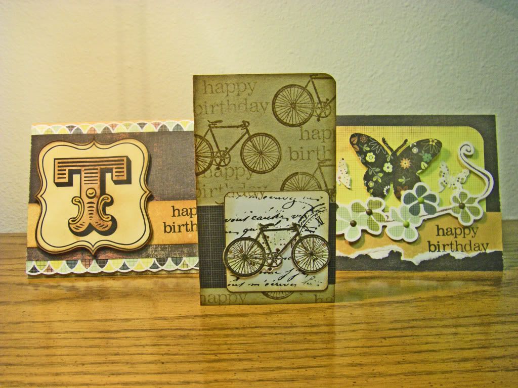
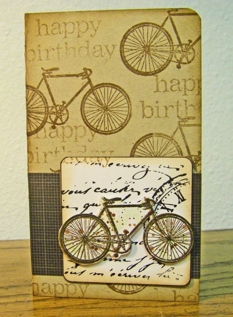
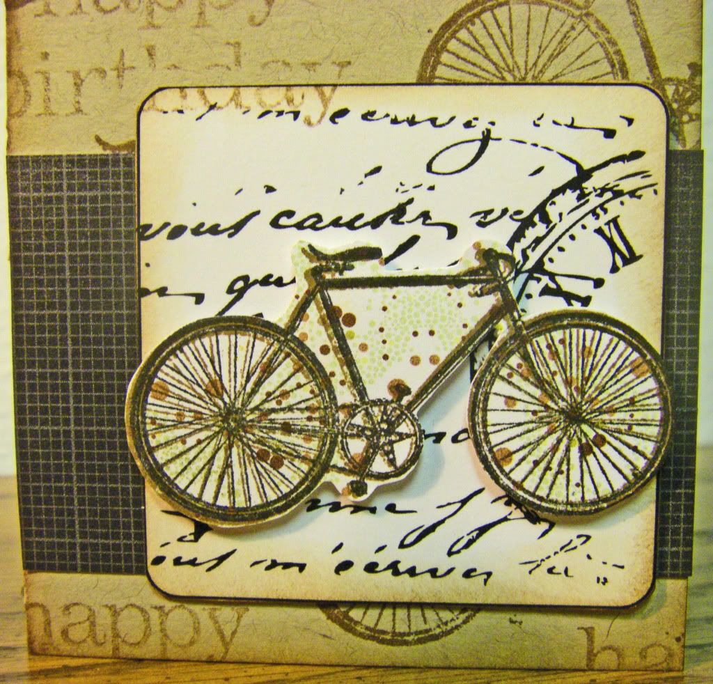
First up is a little card made of scraps from kraft cardstock from my Christmas Cookie Recipe Book project.  These pieces of cardstock (measuring 6 inches by 5 inches) make the most interesting small sized cards (3 inches by 5 inches) which I would have never used had I not had a stack of them to use up in whatever way I wanted.  Yes, it is another masculine card.  This one showcasing a bicycle stamp by Studio Calico.  Isn't it a great stamp?  The other element I wanted to specifically mention is the square the main bicycle is upon.  That square is from a digital kit I bought and downloaded from House of 3.  If you have never been to House of 3's website go, go, go, now, now, now!  They have sensationally wonderful digital (and physical) products.  Often the products have printable elements that take no fuss if you don't want to mess with the elements digitally.  I found a whole sheet of these printable "blank" squares in my Magnet Board Project Kit and they are fabulous!!  I plan on using them many, many times in the future. 


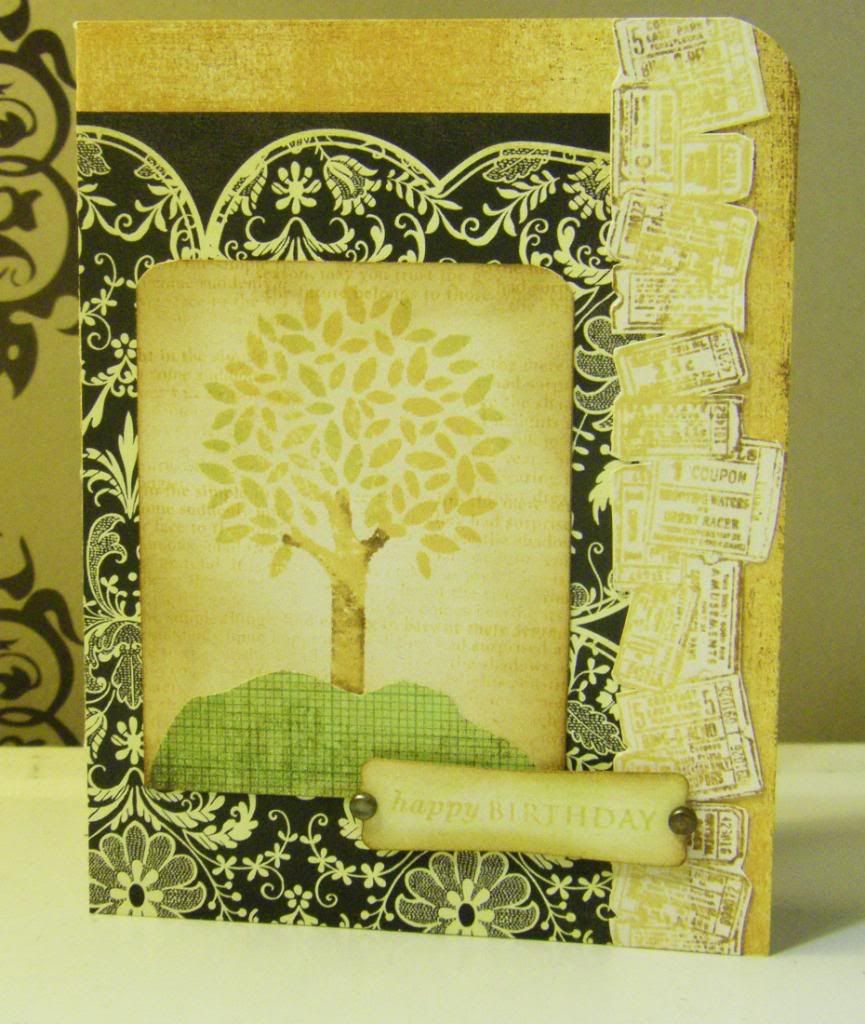
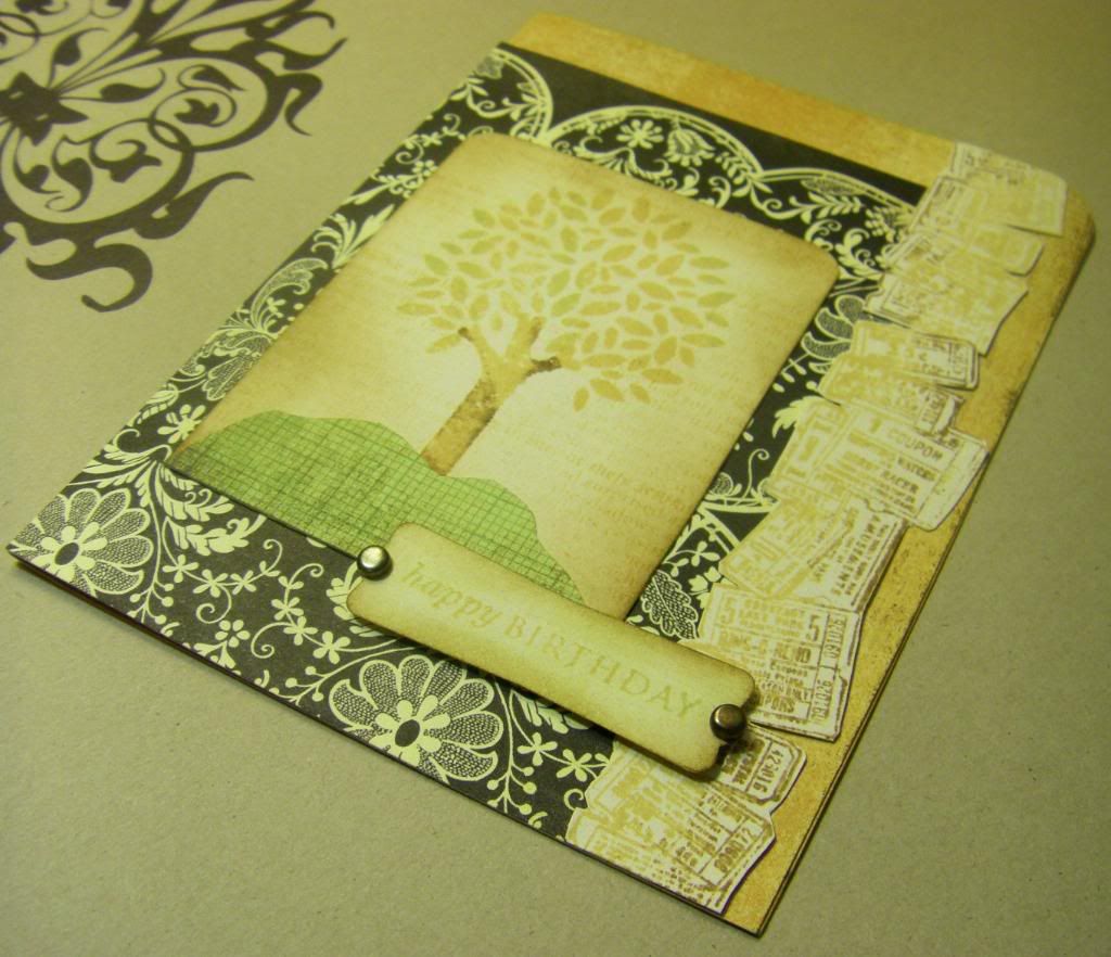
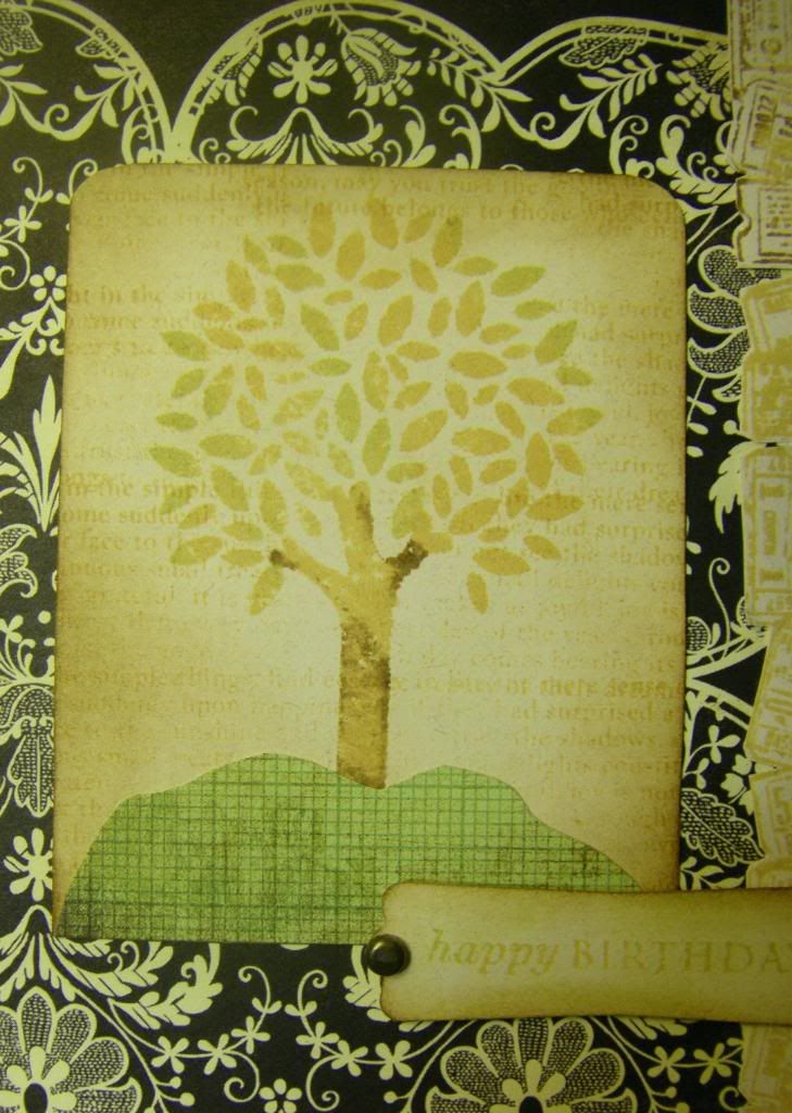
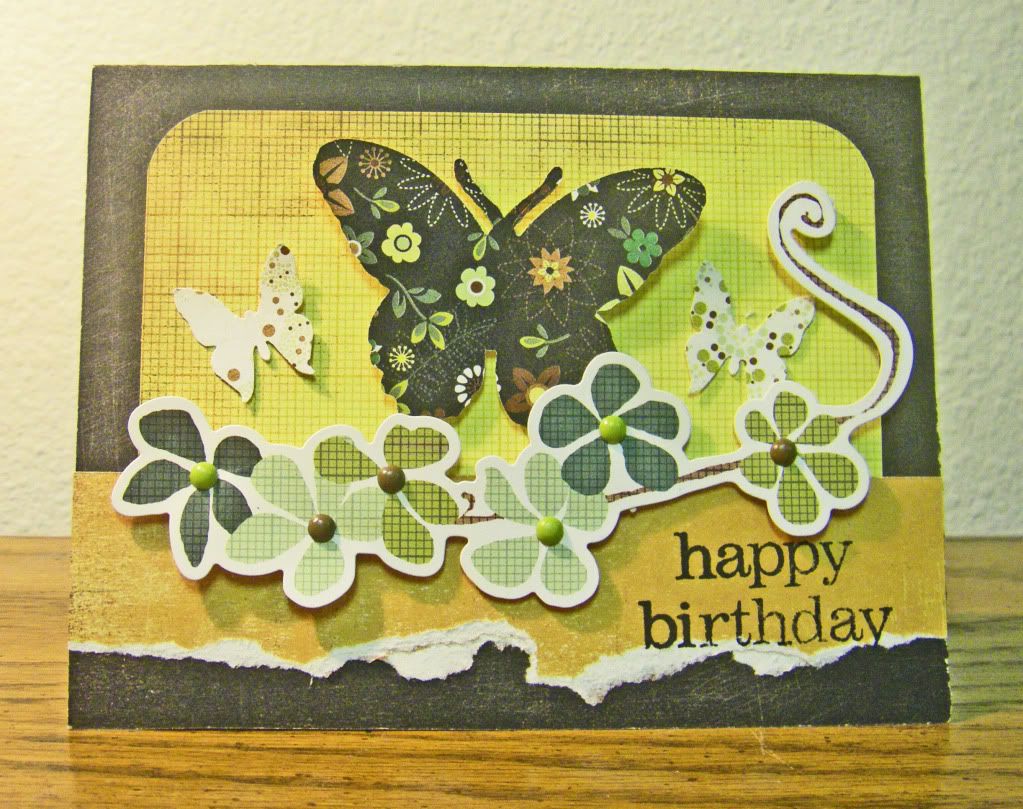
The next card is using the Basic Grey Origins line to make a feminine card (I know you are saying, "At last!  Does she every do feminine cards?).  I can't claim any part in the card design as I started the card in that Basic Grey card class so it is all Basic Grey, but I did pop up the floral cardstock sticker and I added the butterflies all on my own (wow, am I original!).  Wednesday night, I thought the card was sort of shoddy and I felt I had really "cheated", but I felt better about the card in the light of day. 


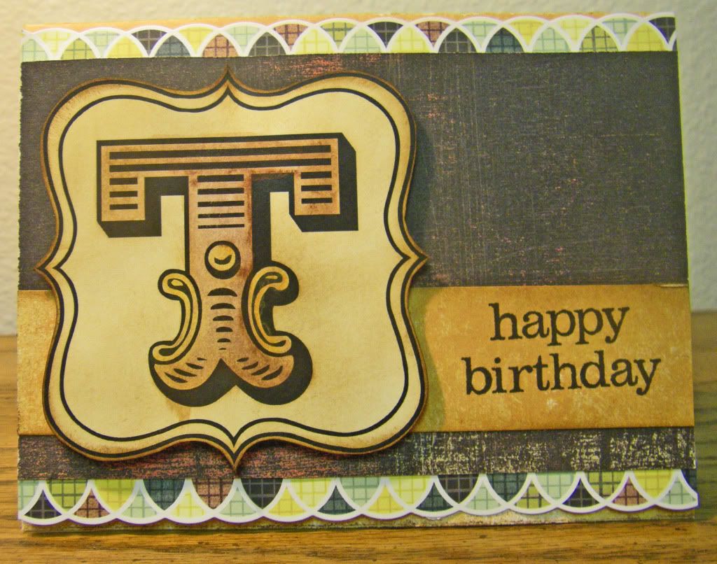
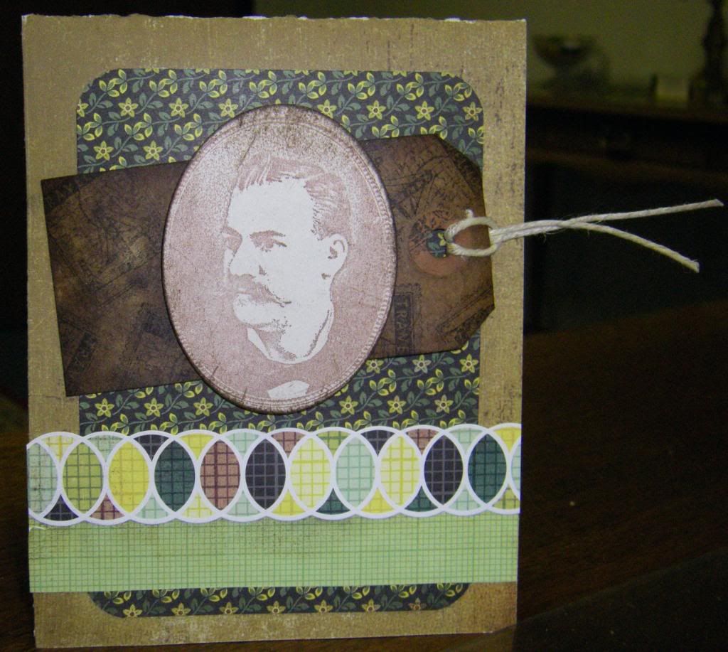
Lastly, is another masculine card using the Basic Grey Origins line and another amazing printable by House of 3, this time from the Monogram Printable Kit.  Each letter is different and can be used to personalize a card or gift or spell out words or names to make banners, scrapbook titles and any other thing your mind can dream up.  Of course you can print the Monograms onto whatever paper you want, but I went with a natural white cardstock which I then distressed and also watercolored with some truly cool water-soluable wax pastels by Caran d'Ache which Donna Downey introduced to my friend in a class she took with her who then introduced them to me in a class I took with my friend (talk about confusing!).  In fact in my draft posts I started writing about the class my friend taught, my awesome friend and these water-soluable wax pastels so one of these days hopefully I will post it.


I hope you have enjoyed these cards and thanks so much for visting the Hall!


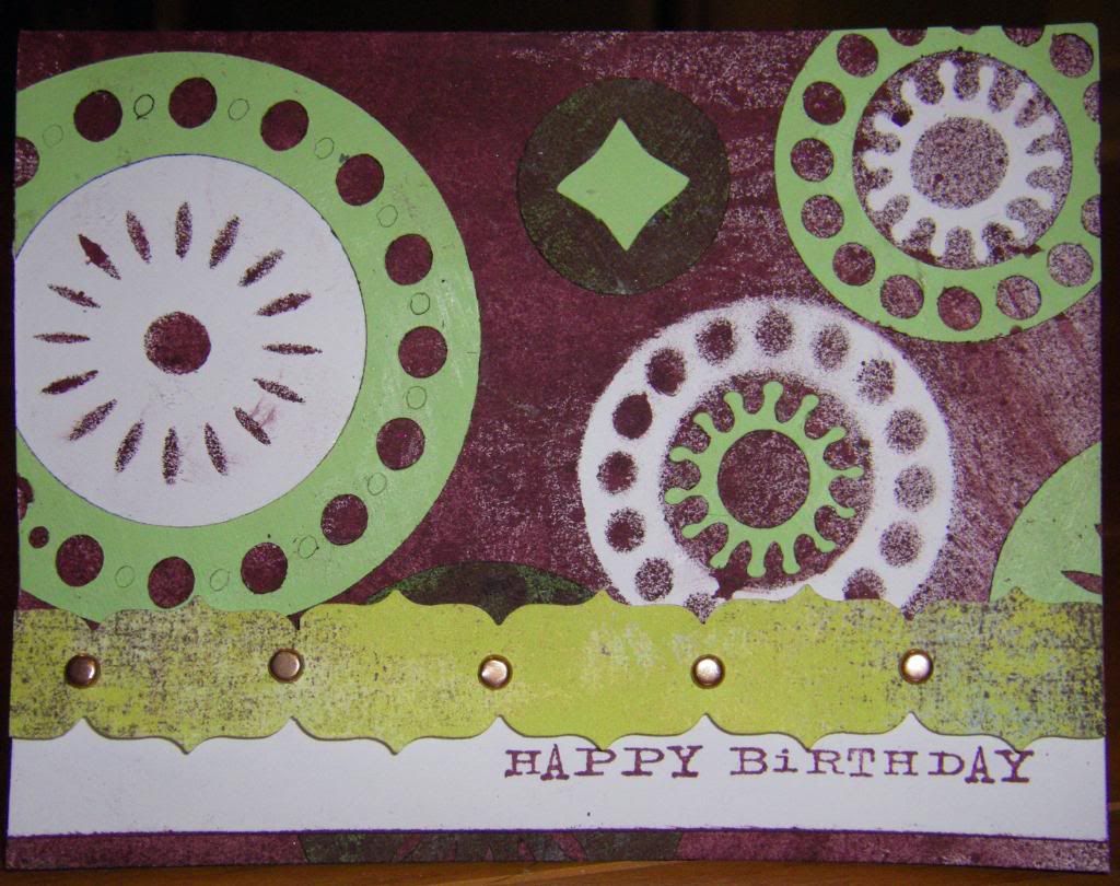
I Want to Ride My Bicycle Birthday Card
Supplies:
Stamps: Bicycle, Studio Calico; Happy Birthday, not sure as any label has been destroyed (If anyone knows, please tell me)
Inks: Vintage Photo, Tim Holtz Distress Ink by Ranger Industries; Jet Black, Archival Ink by Ranger Industries
Cardstock: Kraft, Papertrey Ink; White, Georgia-Pacific
Patterned Papers: Origins line, Basic Grey
Digital Element: Decorative Square (from Magnet Board Project Kit), House of 3
Other: Crop-A-Dile Corner Chomper, We R Memory Keepers; stampin' dimensionals, Stampin' Up!

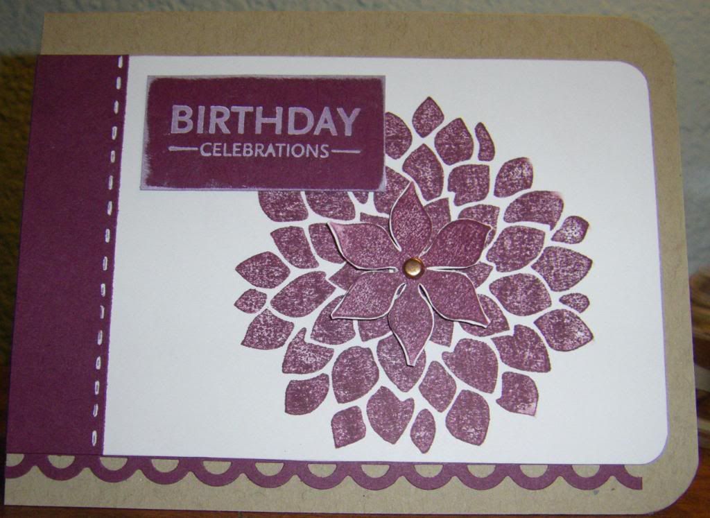
Madame Butterfly Birthday Card
Supplies:
Stamp: Happy Birthday, not sure (see note above)
Ink: Black, Archival Ink by Ranger Industries
Patterned Paper: Origins line, Basic Grey
Cardstock Sticker: Origins line, Basic Grey
Punch: Royal Butterfly, Martha Stewart
Die: Combo Butterfly, Cuttlebug by Provo Craft
Brads: Eerie line, Basic Grey
Other: Cuttlebug, Provocraft; Crop-A-Dile Corner Chomper, We R Memory Keepers; stampin' dimensionals, Stampin' Up!

Fits You to a "T" Birthday Card
Supplies:
Stamp: Happy Birthday, not sure (see note above)
Inks: Vintage Photo, Tim Holtz Distress Ink by Ranger Industries; Jet Black, Archival Ink by Ranger Industries
Cardstock: Recycled 100 Natural White, Neenah Paper
Patterned Papers: Origins line, Basic Grey
Cardstock Sticker: Origins line, Basic Grey
Digital Element: T Monogram (from Monogram Printable Kit), House of 3
Other: Burnt Siena and Golden Cadmium Yellow, Neocolor II Water-Soluable Wax Pastels by Caran d'Ache; stampin' dimensionals, Stampin' Up!

March 5, 2010

Round and Round

Firstly, Thank you to all who stopped by and/or commented on my last card! It is always a delight to have vistors at the Hall.

A year ago, when I received my Cricut from my uncle as a present I was a bit overwhelmed both by his generosity and also with learning how to use the Cricut (afterall I had just bought myself a Cuttlebug and was just starting to see all that could do).  I cut out a lot of shapes from the two cartridges that came with the machine to play around.  A few months later I still had all these shapes sitting around my table getting in the way and as I am someone who loathes throwing things away I decided to challenge myself by using as many of the shapes in cards I was making for the group of March birthdays (in 2009).  I was quite pleased with the results which I will share with you once I find the images, but even so I still had some shapes left over so last October I made a very geometric card for a male relative (yes, another one of those).  Not only did I use them as was, but i also used them as stencils with my Adirondack Color Wash.  I thought the card came out fun and funky myself.


Thanks for visiting!

Circle-tastic
Supplies:
Stamp: Happy Birthday, Catslife Press
Inks: Rich Razzleberry, Stampin' Up!
Cardstock: Luscious Lime, Double Mates by WorldWin Papers; White, Georgia-Pacific
Patterned Paper: Sultry line, Basic Grey
Color Wash: Wild Plum, Tim Holtz Adirondack by Ranger
Border Punch: Upper Crust, Fiskars
Cartridge: Accent Essentials, Cricut by Provo Craft
Other: Cricut Expression, Provo Craft; Copper Mini Brads

March 3, 2010

First Poppy Seed Challenge

Last minute I thought I would do an entry for this brand new challenge by the incomparable Lisa Johnson.  The challenge was to use three seeds: crystals; flower stamp and light yellow. 

My card is pretty dark which was unintentional.  I had a lovely swatch of glossy cardstock I had played around on a couple Friday nights ago at a monthly Hero Arts Club meeting (such a fun event each month by the way) that I felt was too pretty to pass up and would work with light yellow.  So I stamped a bold daisy stamp by Stampin' Up! in black and played around with a Lemon Tart card base.  It was cute, but the black felt heavy and cumbersome until I thought why not really highlight the yellow and pretty alcohol ink background with a black base.  I added a scalloped edge stamped with Polka Dot Basics in Scattered Straw for a slightly distressed look and I really like how that turned out.  The scallop punch I used had a small hole punched out in regular intervals that I decided would be perfect to place the crystals onto.  I realize the picture is poor as you can't see the flecks of metallic gold alcohol ink, but trust me that in person it is pretty.


Thank you so much for stopping by!

Daisy
Supplies:
Stamps: Upsy Daisy, Stampin' Up!; Polka Dots (from Polka Dot Basics II set), Papertrey Ink
Inks: Jet Black, Archival Ink by Ranger Industries; Scattered Straw, Tim Holtz Distress Ink by Ranger Industries
Alcohol Inks: Lettuce, Watermelon, Ginger and Gold, Tim Holtz by Ranger Industries
Cardstock: True Black and Lemon Tart, Papertrey Ink; neutral, Neenah Papers; Glossy
Border Punch: Martha Stewart
Other: Gemstones, The Paper Studio

A Nice Chap

As I posted about one of the Basic Grey Origins cards I had made yesterday, I thought I would share another today which I made back in January (it is already March?!?).  I compulsively buy masculine stamps I feel I can use as through the year I make a fair amount of cards for guys.  The main image here is one I love from a fantastic stamp company, B Line Designs, and it made me realize that the patterns from Origins are reminiscent to those a Victorian fellow might live among everyday of his life.  This bloke (isn't he obviously British?) would most likely have discreet floral patterns in his home whether he was a bachelor or married.  Our man Ross (so the stamp is named) would have a bit of money and culture so he would travel occasionally.  That was the vignette running around my head when I made the card. 

For my Halloween party invitations last year I coffee-stained a slew of tags.  I used one of them for this card and stamped it randomly with an older travel stamp by Hero Arts (although the Golden Gate Bridge is just a bit after the Victorian era).  Looking at this card I realize the tag may have looked better if it were vertically placed, but it isn't awful as is. 


Hope you enjoyed seeing Ross and thank you for stopping by!

Ross
Supplies:
Stamps: Ross, B Line Designs; Travel Postage Stamp, Hero Arts
Ink: Aged Mahogany (I think) and Black Soot, Tim Holtz Distress Ink by Ranger Industries
Patterned Paper: Origins line, Basic Grey
Border Sticker: Origins line, Basic Grey
Other: Crop-A-Dile Corner Chomper, We R Memory Keepers; Oval Nestabilities Die, Spellbinders; Coffee-Stained Shipping Tag; Hemp Twine

March 2, 2010

Lace for Men? Why Not.

I created a birthday card last night for another male relative of mine.  In January I took a Basic Grey card class at a local scrapbooking store using the Origins line.  To be honest at first I was skeptical about the line, but within a few minutes I was sold...really sold on the glorious yellows, greens, browns and black.  This was a set which was gender neutral I suddenly realized with giddiness.  For all those doubters saying: "But there is floral and lace" not to worry!  I used one of the cards I made in the class as a base for this particular card (I haven't used any of the cards exactly as they were designed by Basic Grey as I feel I need to customize them, but they make an excellent jumping off point) which used the black lace patterned paper and it works for a man (hetrosexual no less!).

It is all about the images and accessories.  I went with a lovely tree by Papertrey Ink and the tickets are from Tim Holtz.  Add a little Distress Ink, some text background stamping and mini brads and what man can claim it is girlie?


Close up of the text background.  The card was flexing his [admittedly small] muscles for the camera:


I hope you enjoyed this card.  My thanks for checking out this lacy bad-boy.

Lacy Birthday
Supplies
Stamps: Tree and Sentiment (from the Father Knows Best set) and Text (from Background Basics: Text Style), Papertrey Ink; Tickets, Tim Holtz by Stampers' Anonymous
Inks: Scattered Straw, Shabby Shutters and Vintage Photo, Tim Holtz Distress Ink by Ranger Industries
Patterned Paper: Origins line, Basic Grey
Punch: Modern Label, Stampin' Up!
Other: Crop-A-Dile Corner Chomper, We R Memory Keepers; stampin' dimensionals, Stampin' Up!; mini brads

March 1, 2010

Should Have Been the Day After

I pretty much took the weekend off my blog as I had other obligations (believe me when I say that I would much rather be blogging than cleaning!) 

First (something that should have been posted Friday): my most heartfelt thanks to each and every person kind enough to comment on my last post.  It meant so much to me to not only have you comment, visit my blog, but to be part of the blog hop.  As you no doubt figured out my blog has never experienced so much love! 

My first blog hop was wonderful.  I was overwhelmed with the amount of blogs in the hop (100+), the quality of the projects and the kindness of those that participated.  I loved seeing everyone's blog  and I hope I left a comment at each blog (Friday I caught two I had missed last night).  I also believe I added each blog onto Google reader so I can keep up with everyone's blog.  I can't believe what I saw on your blogs just this weekend!  So amazing.

As a further update the clients I made the sympathy card for called to thank us for the card.  I think pet owners really appreciate recognition of the importance of their pets in their lives.  As someone who loves my dogs dearly I relate (can there be such a person as a dog lady?).  I am so glad Papertrey Ink were thoughtful enough to create the With Sympathy: Loss of a Pet set.

I know this post has no images, but sometimes a girl has to get what needs to be done, done.  Again, thank you all!

LinkWithin

Related Posts with Thumbnails